Welcome to the blog... great articles on the Divi theme
Videos, examples, links and lots of other information about the Divi drag and drop pagebuilder theme - the theme to beat in 2014
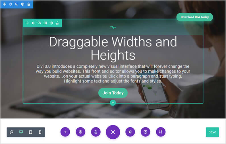
Divi Visual Builder – creating whitespace with draggable widths and heights
When designing web pages, it’s easy to get carried away with content and forget about the areas around your content, the whitespace, the empty space.
The right amount of whitespace makes your content easy on the eye, shows it to best advantage and leads your visitors effortlessly from section to section.
Lack of whitespace presents your visitors with information overload at best and makes your page almost impossible to read at worst.
Fortunately, Divi has always allowed you to set margin and padding values, via the Settings panels, and Divi 3.0’s Visual Builder makes it even easier.
You can still access the Settings panels whilst working with the Visual Builder but in addition you can now drag to increase or decrease the padding of Rows and Sections, which increases or decreases the element’s width and height.
In this post I’ll remind you how to access an elements Settings panel to change margin and padding values, show you how to use draggable padding for Sections and Rows and introduce you to a few Hotkeys that make using draggable padding even easier.
read more…

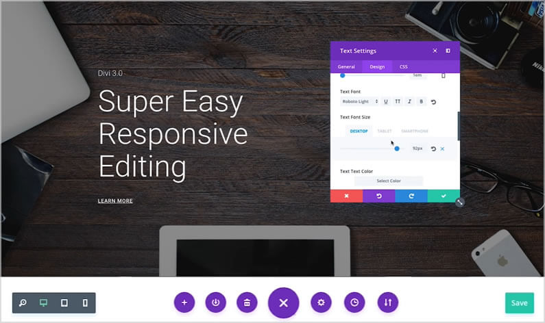
Divi Visual Builder – Super easy responsive design for desktop, tablet and smartphone
Divi already has a great set of responsive editing controls for desktop, tablet and smartphone, but the introduction of the Visual Builder has taken the use of those controls to a whole new level.
Divi’s responsive editing controls were introduced in Divi 2.6 and they allow you to assign different sizing and spacing values for each device / breakpoint.
All Modules, Rows and Sections were also given a new “Disable On” setting that allows you to disable the element on smartphones, tablets and/or desktop computers.
The new Visual Builder allows you to use all the existing responsive editing controls but it shows you the results of your edits in real-time and on the actual page.
In this post, I’ll remind you of Divi’s existing responsive editing controls and show you how to use them in conjunction with the Visual Builder in order to get instant feedback and make responsive editing a whole lot easier.
read more…

Divi Visual Builder – Editing History panel
I’m still getting to know the Divi Visual Builder but already, one of the features that I’ve fallen in love with is the Editing History panel.
The Editing History panel is part of the Page Settings and it shows a list of all your editing actions for that particular session.
It has settings, which allow you to undo and redo or you can scroll up and down your editing history and jump directly to a particular point in time.
The default WordPress dashboard doesn’t allow you to easily move forwards and backwards in your editing history, so I for one welcome this great feature.
In this post, I’ll show you how to access the Editing History panel via the page settings and run through the various ways you can use it to undo, redo and jump around in your editing history.
read more…

Take the Divi 3.0 Visual Builder for a free test drive
I keep telling everyone that they’ll love the Divi 3.0 Visual Builder, but what if I’m wrong and when you try it, you decide that front-end editing isn’t for you?
Fortunately Elegant Themes have come up with a solution.
They’ve set up a free Divi 3.0 demo site where you can play with the Visual Builder to your heart’s content, without wreaking havoc on your own site.
It’s a great idea but playing with a demo site can be a tad uninspiring because you’re only playing, you’re not doing it for real and you lack direction.
So in this post I’ll introduce you to the demo site, run through the basic building blocks (Sections, Rows and Modules) used to create a page using the Divi Builder and to give you a little direction, I’ll set you three tasks to complete on the demo site.
And don’t worry, you can’t do any damage so let rip, have a good time and see what front-end editing is all about!
read more…

Divi Visual Builder – 10 reasons why you’ll love using Divi 3.0’s Visual Builder
I’m now using the new Divi 3.0 front-end Visual Builder on real page edits such as changing text, adding new Sections and content… and I’m absolutely loving it.
But what about you, are you using it yet?
Before we talk about the Visual Builder and why you should be using it, let me remind you of a couple of important points:
First: you don’t have to use the front-end Visual Builder, you can stay in the WordPress back-end and build your sites with Divi’s standard drag-and-drop interface, and that’s perfectly fine.
Second: everything that you’ve learnt about working with Sections, Rows and Modules and configuring elements using the settings panel, still holds good when you use the Visual Builder. That means that all the knowledge you have about the back-end Builder can be used when you use the front-end Builder.
Having made those two important points, I’ll now remind you exactly what the Visual Builder is and then I’ll give you my top ten reasons why you’ll love using it.
read more…


