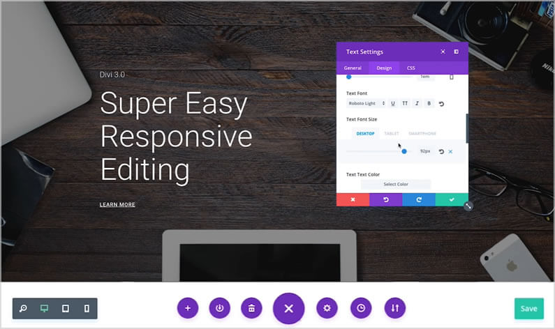
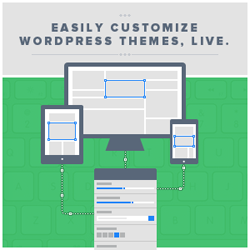
Divi already has a great set of responsive editing controls for desktop, tablet and smartphone, but the introduction of the Visual Builder has taken the use of those controls to a whole new level.
Divi’s responsive editing controls were introduced in Divi 2.6 and they allow you to assign different sizing and spacing values for each device / breakpoint.
All Modules, Rows and Sections were also given a new “Disable On” setting that allows you to disable the element on smartphones, tablets and/or desktop computers.
The new Visual Builder allows you to use all the existing responsive editing controls but it shows you the results of your edits in real-time and on the actual page.
In this post, I’ll remind you of Divi’s existing responsive editing controls and show you how to use them in conjunction with the Visual Builder in order to get instant feedback and make responsive editing a whole lot easier.
My Affiliate Links Disclosure
Hi everyone. Just to let you know that many of the links on this site are my affiliate links. What that means is that if you click one of them and buy something… I get a commission. It doesn’t cost you anything extra and I only recommend things that I’ve tried and tested, so please, please, please… use my links.
An overview of responsive editing with Divi and the Visual Builder
The new Visual Builder has a set of responsive design toggles that you can use to quickly take a look at your page on desktop, tablet and smartphone.
You can toggle these different views while you edit your page and the visual builder shows you exactly how your page will look on that particular device.
The instant feedback combined with Divi’s existing responsive editing controls means that it is now easier than ever to build a beautifully responsive website.
This short video by Nick Roach of Elegant Themes, was released as part of the sneak peek series of videos leading up to the release of Divi 3.0 with its Visual Builder.
There is no commentary on the video but it still gives a great overview of responsive design using Divi.
Divi’s responsive editing controls using the back-end Builder
Divi’s responsive design and fluid grid make it looks pretty good on any device, straight out of the box, but there are always those areas that you want to tweak for tablet or mobile viewing.
Making those final adjustments used to mean delving into Media Queries, but Divi 2.6 relieved you of that dubious pleasure with its new Responsive Editing Controls.
The Divi Builder’s Responsive Editing controls allow you to assign different sizing and spacing values for each device / breakpoint.
When you’re working in the back-end Builder you can make your responsive edits for Modules, Rows and Sections using the smartphone icon under the Advanced Design Settings tab as shown below:
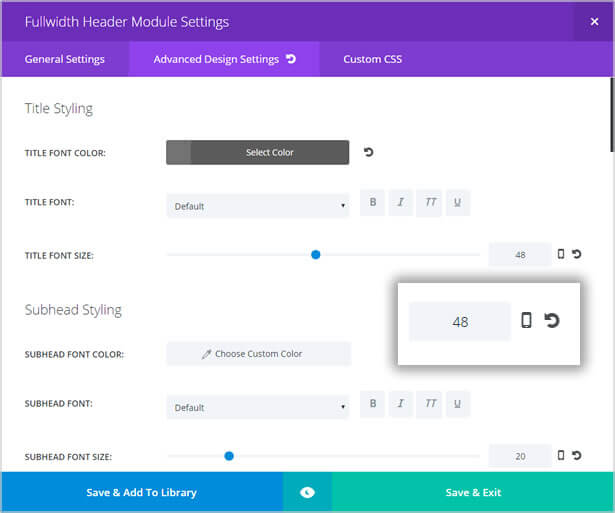
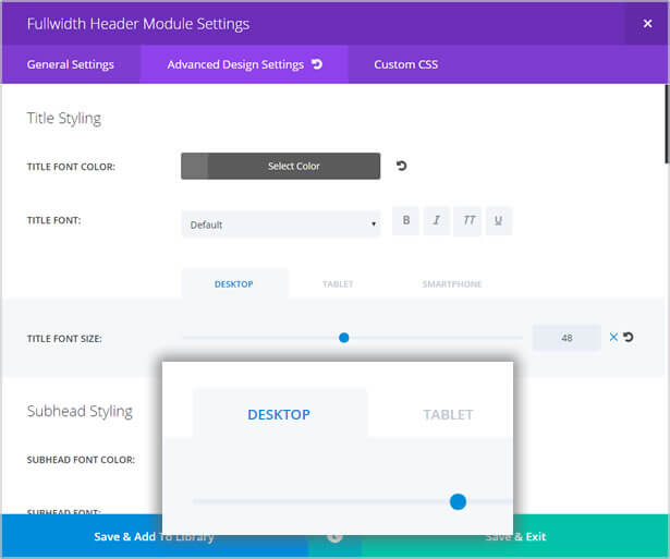
Click the smartphone icon and the Divi Builder’s responsive editing controls appear above the slider control bar.
The editing controls consist of three tabs: DESKTOP, TABLET and SMARTPHONE.
These controls allow you to assign unique values for each device / breakpoint.
All Modules, Rows and Sections also have a “Disable On” setting that allows you to disable the element on smartphones, tablets and/or desktop computers.
This is great when you want to strip down your website’s mobile version so that the small screen is not crowded with too much information.
To disable an element: hover over the element and right click, from the menu which pops up click Disable and then click the appropriate device icons – the icons you click will turn red, to show that they have been selected.
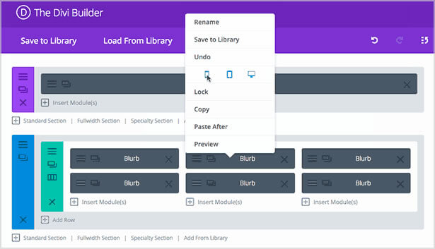
What does the Visual Builder bring to the responsive editing party?
You can do all your responsive design using Divi’s responsive editing controls in the back-end Builder, but the Visual Builder makes things a whole lot quicker and easier and much more satisfying.
Accessing the responsive editing controls in the Visual Builder
Accessing the responsive editing controls is done by clicking the gear icon in the toolbar for a particular Section, Row or Module.
Clicking the gear icon brings up the element’s Settings panel with its three tabs: General, Design and CSS.
The responsive editing controls can be found under the Design tab and the use is exactly the same as when using the back-end Builder.
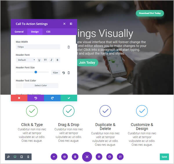
Visual Builder responsive design toggles
The new Visual Builder has a set of responsive design toggles that you can use to quickly take a look at your page on desktop, tablet and smartphone.
You can toggle these different views while you edit your page and the Visual Builder shows you exactly how your page will look on that particular device.
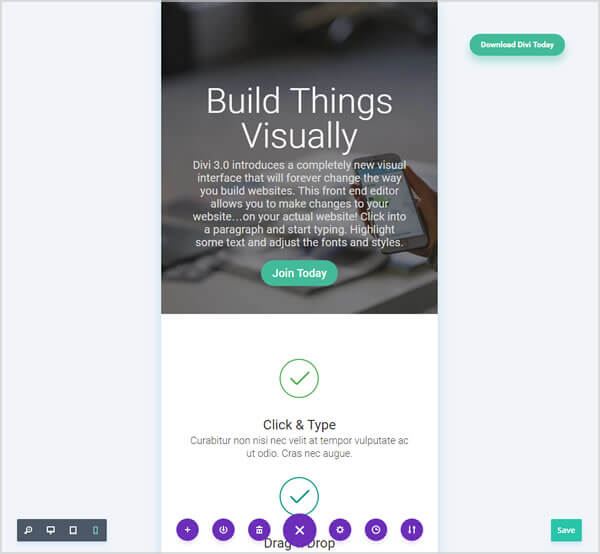
The responsive design toggles are accessed via the purple icon, which appears at the bottom of the page when you are editing in Visual Builder mode.
Click the purple icon and the responsive design toggles appear on the left-hand side with the familiar desktop, tablet and smartphone icons.

Click any of the icons and the page will appear as it would be seen on that device.
The screenshot below is taken from the Elegant Themes Divi 3.0 demo site and shows the page with the smartphone icon active.
Immediate visual feedback
If you make your responsive edits using the back-end Builder you have to hit the “preview” button to see what it looks like, but even then, you’re not looking at the actual page.
You can take a look at the actual page by saving your changes, updating and refreshing the page, but that is pretty long winded and for a lot of edits it would take forever.
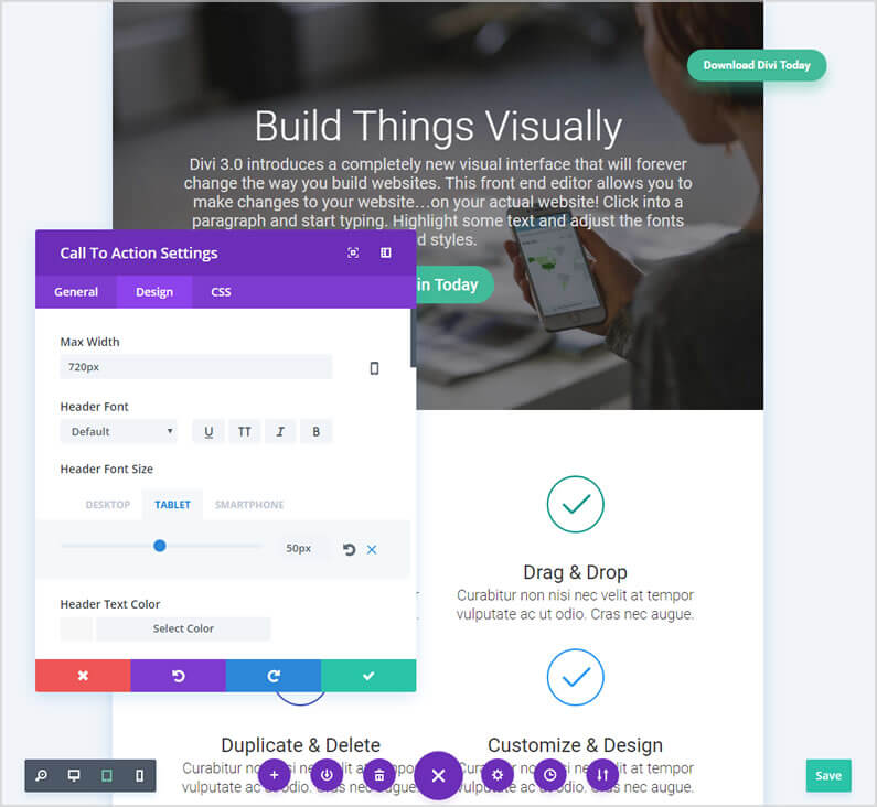
It’s much easier and much quicker to edit on the actual page, using the Visual Builder, where you get that all important Immediate visual feedback.
The screenshot below is taken from the Elegant Themes Divi 3.0 demo site and shows the page being edited in tablet view with the Header Font Size reduced from 62px to 50px.
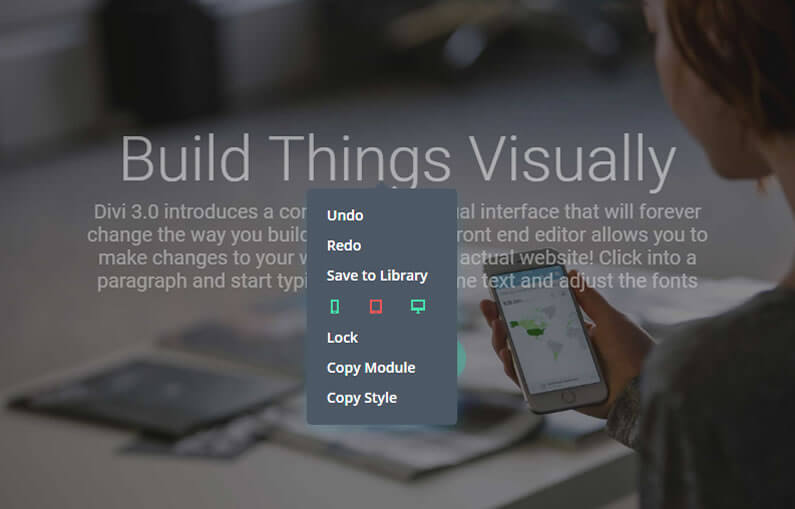
You can also disable elements for particular devices using the Visual Builder.
To disable an element on particular devices, right click on the elements toolbar, from the popup click Disable and then click the devices that you would like the element to be disabled on – the icons you click will turn red, to show that they have been selected.
The screenshot below is taken from the Elegant Themes Divi 3.0 demo site and shows the page with the top Call-to-Action Module disabled on tablet view – note that the tablet icon has turned red and that the Call-to-Action text and button have been ghosted out.
Try out the Visual Builder’s responsive editing controls for yourself
You can try out the Visual Builder’s responsive editing controls for yourself on the free Divi 3.0 demo site.
To get to the demo site just hit the big green button below:
Take your responsive design to the next level with the Divi Visual Builder
With more and more of us accessing the web on tablets and smartphones, what your website looks like on mobile devices has never been more important.
Divi responsive editing controls allow you to fine tune and hide content in order to give all your visitors the optimum viewing experience whatever device they are viewing on and all this… without touching a single media query!
Add to this the immediate visual feedback that the Visual Builder’s on-page editing provides and it really has never been easier to build a beautifully responsive website.
The Future of WYSIWYG: When you make a change in the new visual builder, your page is updated instantly. Text on the page feels tangible as you slide the font size controls and watch your words expand and contract with each gesture.
The page feels alive as you explore the color picker and watch each glowing transformation.
If you’d like to swap “content creation” in the back-end of WordPress for “creative designing” on the actual pages of your website, then sign up with Elegant Themes and start using the Divi 3.0 Visual Builder today.
Take the Visual Builder for a free test drive and try out the on-page responsive editing controls
If you’re not a Divi user, you can still take the Visual Builder for a free test drive and try out the on-page responsive editing controls, by hitting the big green button below!

Create your WordPress masterpiece with Divi 3.0’s Visual Page Builder
I hope that you enjoyed the post and that you are as excited about Divi 3.0’s front-end editing as I am.
If you have any thoughts about the Divi 3.0 Visual Builder in general or the on-page responsive editing controls in particular, then please leave a comment and if you’d like to spread the word about this fabulous On-Page theme, please use my social sharing icons below.
Credits:
My thanks and gratitude to Elegant Themes for the video and graphics used in this post.
