When designing web pages, it’s easy to get carried away with content and forget about the areas around your content, the whitespace, the empty space.
The right amount of whitespace makes your content easy on the eye, shows it to best advantage and leads your visitors effortlessly from section to section.
Lack of whitespace presents your visitors with information overload at best and makes your page almost impossible to read at worst.
Fortunately, Divi has always allowed you to set margin and padding values, via the Settings panels, and Divi 3.0’s Visual Builder makes it even easier.
You can still access the Settings panels whilst working with the Visual Builder but in addition you can now drag to increase or decrease the padding of Rows and Sections, which increases or decreases the element’s width and height.
In this post I’ll remind you how to access an elements Settings panel to change margin and padding values, show you how to use draggable padding for Sections and Rows and introduce you to a few Hotkeys that make using draggable padding even easier.
My Affiliate Links Disclosure
Hi everyone. Just to let you know that many of the links on this site are my affiliate links. What that means is that if you click one of them and buy something… I get a commission. It doesn’t cost you anything extra and I only recommend things that I’ve tried and tested, so please, please, please… use my links.
An overview of draggable widths and heights
Divi’s new Visual Builder still allows you to set margin and padding values for an element using its Settings panel but now you also have draggable padding values for Rows and Sections.
You’ll probably find that you use a combination of both methods to produce perfect results, but whichever method you use, the Visual Builder will provide you with instant feedback.
This short video by Nick Roach of Elegant Themes, was released as part of the sneak peek series of videos leading up to the release of Divi 3.0 with its Visual Builder.
There is no commentary on the video but it still gives a great overview of creating whitespace using draggable widths and heights in conjunction with setting margin and padding values via the Settings panels.
A reminder: Padding, Margin and Gutter
Just in case you’ve forgotten your CSS box model terms:
Padding – is the space that’s inside the element between the element and the border. Padding goes around all four sides of the content and you can target and change the padding for each side with CSS.
Margin – is the space between the border and the next element. The space outside the border between it and the other elements is the margin. Just like padding, it’s possible to target all four sides of an element to change its margin.
Gutter – is the same thing as margin, but the term is used to refer to the space between columns. So when you have a Divi row with multiple columns, the space between each column is the gutter.
Setting margin and padding values from within the Visual Builder
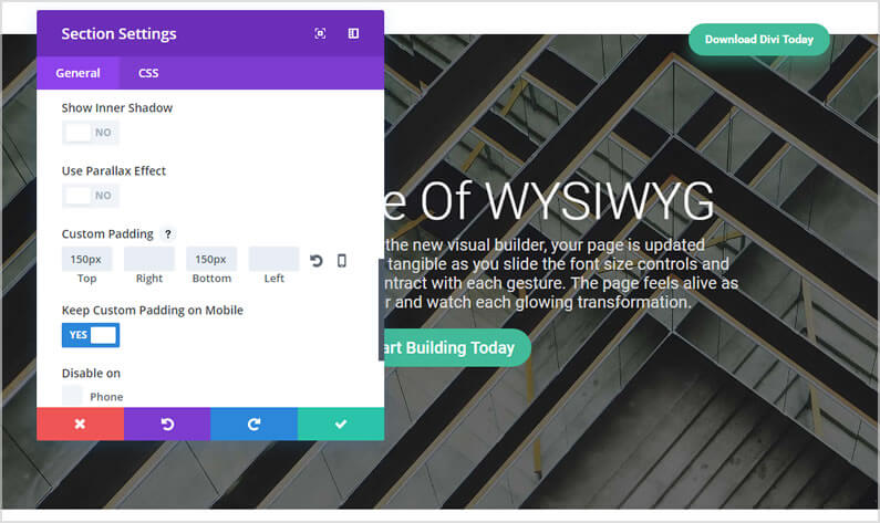
If you’re working in the Back-end Builder margin and padding values are set via an element’s Settings panel and it’s the same when you’re using the Visual Builder.
The great thing about setting your margin and padding values from within the Visual Builder is that the results will be shown on your page almost instantly.
To access an element’s Settings panel from within the Visual Builder:
- Hover over the element until its toolbar appears at the top left. The toolbars are blue for Sections, green for Rows and grey for Modules.
- On the toolbar click the gear icon and the element’s Settings panel will appear.
- Set your values for margin and padding, which will be under the General or Design tab.
Quick tip – you can also access an element’s Settings panel by double clicking within the Section, Row or Module whilst working in the visual Builder.
The screenshot below shows a Section’s Settings panel, which has been activated via the Visual Builder.

Draggable widths and heights for Rows and Sections
You can set all your margin and padding values using an element’s Settings panel, but in order to take full advantage of the builder’s visual nature, Elegant Themes have introduced draggable padding values for Sections and Rows.
When you place your cursor over any of the four sides of a Row or Section, you can drag to increase or decrease the padding thereby increasing or decreasing the element’s width and height.
The great thing about this is that you can see the changes take place instantly as you drag your mouse!
Row padding is shown with green shading
To make life a bit easier when you drag Row padding, the padding is shown in green, which is the colour associated with Rows.
As you drag the padding the padding value is also shown in pixels.

Section padding is shown with blue shading
Section padding is shown in blue, the colour associated with Sections, and the padding value is shown in pixels.

White space is one of those things that you need to see and feel to understand and the Visual Builder allows you to do just that.
The first time you start working with draggable padding and drag open the height of a section, you’ll realise just what a powerful tool has been added to the Visual Builder.
Hotkeys to make draggable padding quicker, easier and much more useful
Elegant Themes have recently added hotkeys to the Visual Builder and here are three that make draggable padding quicker, easier and much more useful.
#1 – Limit the height or width change to increments of 10
Holding Shift while you drag will limit the height or width change to increments of 10.
So if you want to increase your Section padding to 100px, you can just hold down the Shift key and drag straight to the correct value in increments of 10.
#2 – Mirror padding values
You can also mirror padding values. If you drag padding on one side whilst holding Shift + Alt, the padding on the opposite side will be updated to match the current side you’re adjusting.
#3 – Limit padding values
You can also hold Alt while dragging and it will limit the height or width of the current padding value to be no greater than the padding on the opposite side. This is an easy way to quickly increase or decrease padding on any side to match the exact value on the opposite side.
The screenshot below is taken from the Divi 3.0 demo site and shows the result of mirroring padding values.

Get creative with whitespace with draggable widths and heights
The right amount of whitespace makes your content easy on the eye, shows it to best advantage and leads your visitors effortlessly from section to section. In short: whitespace provides the satin backdrop to your visual gems.
Divi has always made it easy to add whitespace via padding and margin controls in the element’s settings and the the addition of draggable padding in the Visual Builder, it just got easier.
The Future of WYSIWYG: When you make a change in the new visual builder, your page is updated instantly. Text on the page feels tangible as you slide the font size controls and watch your words expand and contract with each gesture.
The page feels alive as you explore the color picker and watch each glowing transformation.
If you’d like to swap “content creation” in the back-end of WordPress for “creative designing” on the actual pages of your website, then sign up with Elegant Themes and start using the Divi 3.0 Visual Builder today.
Take the Visual Builder for a free test drive and try out the on-page draggable padding feature
If you’re not a Divi user, you can still take the Visual Builder for a free test drive and try out the draggable padding feature, by hitting the big green button below!

Create your WordPress masterpiece with Divi 3.0’s Visual Page Builder
I hope that you enjoyed the post and that you are as excited about Divi 3.0’s front-end editing as I am.
If you have any thoughts about the Divi 3.0 Visual Builder in general or the on-page draggable padding feature in particular, then please leave a comment and if you’d like to spread the word about this fabulous On-Page theme, please use my social sharing icons below.
Credits:
My thanks and gratitude to Elegant Themes for the video and graphics used in this post.


