I had intended to start 2015 at a leisurely pace and maybe get out a post in about a week’s time and then I saw Monterey Premier, a Divi theme site by Geno Quiroz, and ten minutes later… I was writing this post.
The first thing to say is that my screenshots don’t do this site justice, this is a “must see in widescreen format” website so make sure that you pay Monterey Premier a visit.
The second thing to say is that I could write half a dozen posts pointing out the subtleties and finer points of this site, and still not cover everything. So I’m going to concentrate on the three things that first caught my attention: the logo, the top navigation and the oh so cool contact form.
Geno Quiroz is an independent small business consultant with a background in accounting, web design, graphic design, sales, marketing, business management, information technology and operations efficiency management.
He has been designing websites since 1996 and currently leads a network of designers, developers and SEO specialists from around the globe who are focused on building elegant websites for customers all over the world.
My Affiliate Links Disclosure
Hi everyone. Just to let you know that many of the links on this site are my affiliate links. What that means is that if you click one of them and buy something… I get a commission. It doesn’t cost you anything extra so I hope that you will use my links.
Mix up those fonts and colours to produce a stunning logo
One thing that every website has to do is grab and hold visitors attention as soon as they arrive.
Monterey Premier does that with a simple but stunning logo on a dark parallax background, which produces that jaw dropping impact that we all strive to achieve.
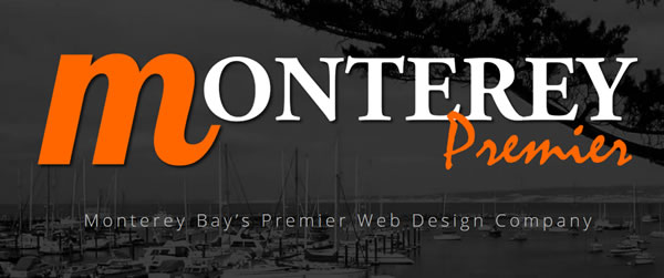
The two elements that combine to make this a great looking logo are fonts and colours:
Fonts – the fonts that make up the logo are standard Google fonts, but they are combined, using upper and lowercase, to produce a gorgeous effect.
Colours – the logo uses two colours, orange and white. The orange to grab your attention and the white because too much orange can be overpowering. The dark background also tones down the orange and provides a fabulous contrast.
Geno tells me “I put a lot of thought into the simple logo design” for reasons that he explains in the short conversation below:
Keith Davis: A great combination of fonts and colours Geno.
Now can we do that in real text and CSS positioning and Z values?
Only kidding but I hate using graphical text.
Geno Quiroz: Glad you mentioned it Keith. I intended to do that which is why the logo consists of standard Google fonts. I put a lot of thought into the simple logo design for that very purpose. Not to mention I wanted a standalone letter to use as an alt logo.
Distraction free top navigation… or did you miss it?
Head back over to Monterey Premier and note that when you first hit the homepage there is no top navigation, the first thing you see is that awesome logo.
The top navigation only appears as you start to scroll down the page.
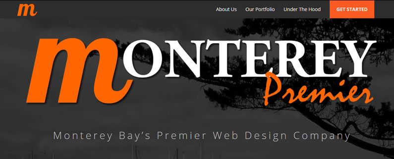
The beauty of not having the top navigation show up until you start to scroll is that it provides your visitors with a distraction free page when they first arrive.
It’s a clever and discreet way of directing the focus of a page away from the navigation and towards more important and relevant areas of your choosing.
Check out Geno’s CSS
When you visit Geno’s site you may want to see how he achieves some of his effects by taking a look at his CSS.
If you don’t know how to check CSS on web pages and make CSS changes on your own site then check out my post Firebug, Chrome Dev tools and CSS Hero.
And don’t forget as Geno says himself “One man’s stealing is another man’s reverse engineering”.
A colour-coordinated contact form to die for
Geno’s contact form blends perfectly with and compliments the rest of the site.
It uses the signature colour scheme of orange and white on a dark background and it looks so good…. who wouldn’t want to use the services of the guy who produced this?
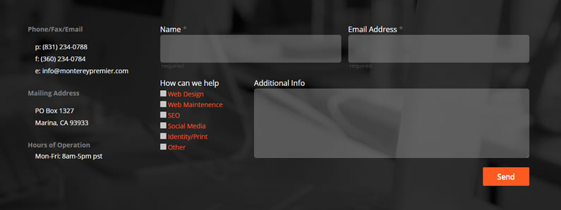
The colours, proportions and the additional set of check boxes under “How can we help” combines function and aesthetics to make this a great looking stand out form.
The form was produced using the Caldera forms plugin, which is a free plugin that you can try yourself and the icing on the cake is that Geno has promised me a tutorial on how he configured and styled his form.
As soon as it’s available I’ll add a link to this post.
Keith Davis: This contact form is fabulous…. please, please, please can we have a tutorial…
I would pay cash money for this.
Geno Quiroz: Sure Keith. Just for you I will push this topic to the top of my list. It was pretty easy using Caldera forms. I built it on my old site and it allowed me to export it to this site. I will make this my very next tut but probably wont be until next week
Geno’s Divi theme tutorials
As well as being a showcase of great design, Geno’s site is also full of top quality Divi tutorials, which range from “changing the number of columns in the footer” to “customising the pricing tables module”.
These are the last ten that he posted:
#1 – Change Footer Columns in Divi #2 – Ghost Home Page and Changing Menu Color in Divi #3 – A Simple Slider Alternative for Divi #4 – Expanding Your Icon Font Library in Divi Using Font Awesome #5 – Expand Logo and Main Menu Fullscreen Width in Divi #6 – Customizing the Pricing Table in Divi #7 – Customizing the Subscribe Module in Divi #8 – Customizing the Testimonial Module in Divi #9 – Add image to an mp3 podcast #10 – Adding a Fullwidth Menu in Divi
If any of those titles sound useful or you’d like to see the full list of tutorials then check out his great collection of Divi tips and tutorials
Think what you could achieve with the Divi theme… and a little inspiration
Websites with the functionality and visual complexity of Monterey Premier were once the province of a small number of graphic designers working with WordPress developers.
The advent of drag and drop themes like Divi and guys like Geno who are prepared to share their skills with the rest of us, means that we all now have the tools, knowhow and inspiration to unleash our own imagination and produce our own works of art.
If Geno’s fabulous site has fired up your imagination and you’d like to use the Divi theme drag and drop functionality to produce your next website, then sign up with Elegant Themes, download your copy of Divi and start creating today.
We offer no-questions-asked refunds to all customers within 30 days of your purchase. If you are not satisfied with our product, then simply send us an email and we will refund your purchase right away. Our goal has always been to create a happy, thriving community. If you are not thrilled with the product or are not enjoying the experience, then we have no interest in forcing you to stay an unhappy member.
Nick Roach – Elegant Themes
I hope that you enjoyed the post and if you have any thoughts about modern website design in general or Geno’s site in particular please leave a comment and if you’d like to help others become inspired, please use the social sharing icons below.
Credits:
My thanks and gratitude to Geno Quiroz for the graphics used in this post, the inspiration he provides and for helping me get 2015 off to a great start.

