Divi has some great Modules but at the moment my favourite is the upgraded Fullwidth Header Module, complete with new Full Screen functionality.
As well as being able to create over 20 different possible layouts with this module, you now have lots of new styling options that can be applied to each element via the Advanced Design Settings.
The upgraded Module is versatile, easy to use and produces stunning results and in this post I’ll run through how to set it up and take a look at a few examples of the Module in action.
This is the ninth in a series of posts designed to help you become familiar with Divi’s new features, to give you ideas on how and where to use them in practical web design situations and to provide you with resources to help build your Divi Library.
Be sure to check out the other posts in this series:
All you need to know about Global Library Items
Advanced Design Settings and a FREE Library Pack
Create gorgeous Blog Posts with the Divi Builder
Get creative with Divi‘s new Footer Layouts
The Code Modules for shortcode and HTML integration
New Header and Navigation styles and formats
The new options for Rows and how to use them
Colour pickers with semi-transparent colours
My Affiliate Links Disclosure
Hi everyone. Just to let you know that many of the links on this site are my affiliate links. What that means is that if you click one of them and buy something… I get a commission. It doesn’t cost you anything extra and I only recommend things that I’ve tried and tested, so please, please, please… use my links.
Using the Fullwidth Header Module
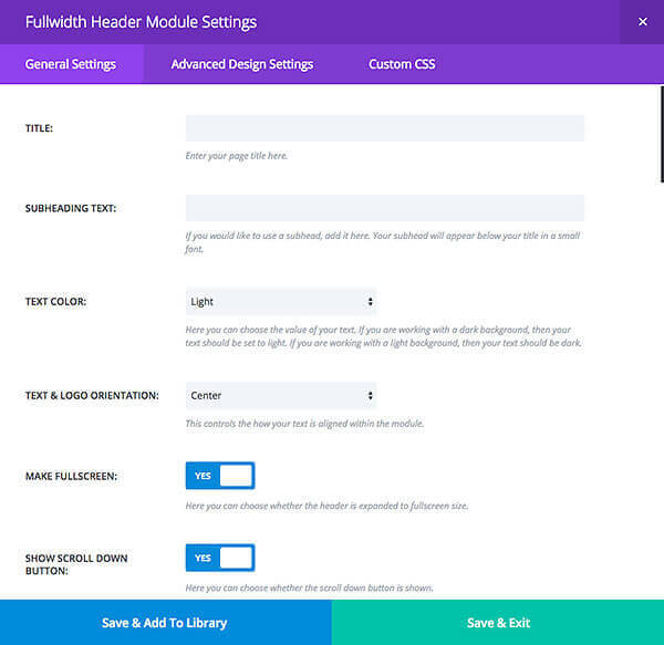
Once you add the Fullwidth Header Module you’ll be presented with the Settings screen, which has three tabs: General Settings, Advanced Design Settings and Custom CSS.
You’ll usually find everything you need under the General Settings but if you want to take things a little further you can use the Advanced Design Settings and if you want to add your own CSS you can do that via the Custom CSS settings.
This video from the Divi theme documentation is a solid introduction to the Fullwidth Header Module.
It covers adding a Fullwidth Section, adding the Fullwidth Header Module and adding content. It then runs through the Settings and combination of Settings to give you a good idea of the sort of effects that can be achieved.
A reminder of the option settings under the General Settings tab
Most of the settings that you need to create great looking headers are under the General Settings and these are the headings that you’ll find there:
Note: The Fullwidth Header Module can only be placed within a Fullwidth Section.
- Title – enter your page title, which will appear in a large font.
- Subheading Text – if you enter a subheading it will appear below your title in a smaller font.
- Text Color – for a dark background choose light. For a light background choose dark.
- Text and Logo Orientation – specify how your text and logo is aligned within the module: left, centre, right or justified.
- Make Fullscreen – choose to expand the header to fullscreen size (width and depth).
- Show Scroll Down Button – choose to show a scroll down button.
- Icon – choose an icon to use as the scroll down button.
- Button #1 Text – the text for button #1.
- Button #1 URL – the URL link for button #1.
- Button #2 Text – the text for button #2.
- Button #2 URL – the URL link for button #2.
- Background Image URL – the URL to the image you would like to display as the background image.
- Background Color – the background colour for the header.
- Background Overlay Color – the background overlay colour, which is placed on top of the background image. Semi-transparent background overlay images can create cool effects when placed above background images.
- Use Parallax effect – gives your background images a fixed position as your scroll, creating a parallax-like effect.
- Parallax method – choose the method to use for the parallax effect.
- Logo Image URL – the URL to your logo image.
- Text Vertical Alignment – the vertical alignment of your content: vertically centered or aligned to the bottom.
- Header Image URL – the URL to your Header image.
- Image Vertical Alignment – defines the position of the Header image: Vertically Centred or Bottom.
- Content – the content that will be placed below the header and title text.
- Admin Label – this is the label, which will be displayed to identify the Module in the Divi Builder.
- CSS ID – add an ID, which can be used to target custom CSS styling or to create links to particular sections of your page.
- CSS Class – add a CSS class, which can be used to target custom CSS styling. You can add multiple classes, separated with a space.
As you can see you can customise just about everything using the Module’s General Settings but if you need more options you can use the Advanced Design Settings or even add your own CSS via the Custom CSS settings.
Note: The Module allows you to use three images:
The Logo Image – this image is placed above your title text and is typically a small logo to represent your company.
The Background Image – the background image is placed behind your header content.
The Header Image – this is an image that can be placed to the left, right or below your text content.
A few examples of the Divi Fullwidth Header Module in action
Enough talk about Modules, background images and Module settings, let’s see what you can produce when you put it all together.
The three examples below show just a few of the many different ways that the Fullwidth Header Module can be used. By choosing different combinations of images, text orientations and colours, you can produce unique layouts without touching a single line of code.
Divi Fullwidth Header Module – example #1
The first example was created by Nick Roach and the guys over at Elegant Themes. It shows what can be achieved when you add a pinch of creativity to the Fullwidth Header Module settings.
It uses three images: a Logo Image, a Background Image and a Header Image.
The Logo Image has been saved as a transparent PNG so that the background image is visible within the negative space of the logo. The Header Image has had its edges faded, so that the transparency can take full effect, and then saved as a transparent PNG.
In order to prevent the white colour of the flour merging with the white colour of the text, a semi-transparent brown “Background Overlay” has been placed on top of the background image to help tone it down.
The header has been finished by activating “Make Fullscreen” and adding a title and two call-to-action buttons.

Divi Fullwidth Header Module – example #2
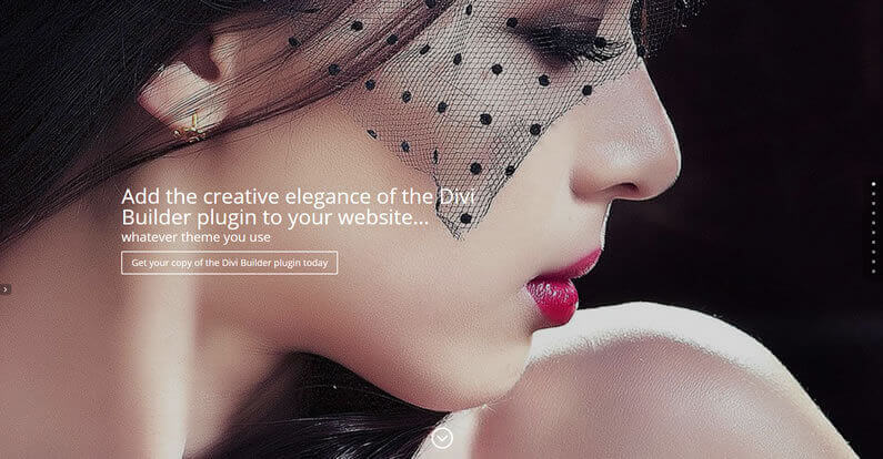
I’m using this Fullwidth Header on my Divi Builder plugin splash page.
I’ve used a great looking image, which emphasises the “Creative Elegance” message and grabs attention, placed the text on the left and restricted its width so that it combines well with the image and I’ve left the colour of the call-to-action button to the default setting.
I’ve also activated the “Make Fullscreen” option and set the whole page to “”Hide Nav Before Scroll”.
The finished header is perfect for a dedicated landing or splash page.
Divi Fullwidth Header Module – example #3
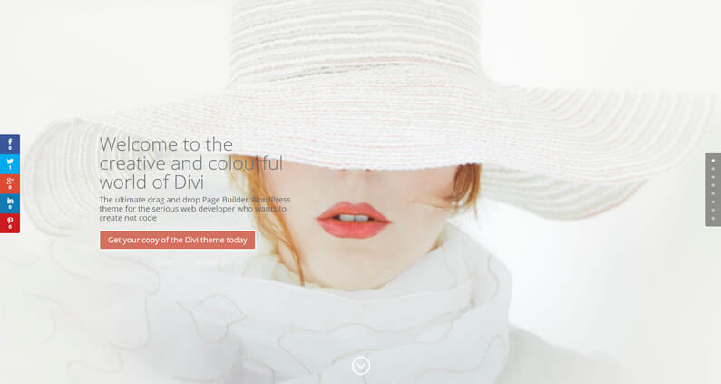
And just to show you how much I love this Module, I’ve even used it on my homepage.
Again I’ve used a great looking image to create maximum impact, placed the text on the left and restricted its width so that it doesn’t cover too much of the lady’s face.
I’ve also set the colour of the call-to-action button to the colour of the lady’s lips and activated the “Use Parallax effect”.
The result is a stunning but simple effect all done via the Fullwidth Header Module Settings without touching a single line of code.
Oh I nearly forgot: in order to get maximum impact from the image I’ve set the page to “”Hide Nav Before Scroll”, which is done using the “Divi Page Settings” at the top right of the WordPress page editing area.
Imagine what the Fullwidth Header Module could do for your homepage…
Perhaps you can see now why the Divi Fullwidth Header Module is my favourite Module. It gives you maximum fullwidth impact for minimum effort and all the settings can be configured within the Settings panel.
If you’d like to start using the Fullwidth Header Module on your site, then sign up with Elegant Themes, download your copy of the Divi theme and start creating stunning headers for your own websites.
Note: If you want to add the power of the Divi Builder to your WordPress website, but you want to keep your existing theme, then you need the Divi Builder plugin. The Divi Builder is a plugin, which works with any WordPress theme and allows you to add all the Divi Builder’s functionality to your website.
This is an example of a page created with the Divi Builder plugin, on a Genesis theme website.
Two thumbs up Nick!
Seems the sky isn’t the limit anymore at Elegant Themes – you just broke through it.
You guys are just incredible!
Serge Brodowicz – Elegant Themes blog
I hope that you enjoyed the post and that it’s shown you the power of Divi’s Fullwidth Header Module and given you a few ideas that you can use on your own sites.
if you have any thoughts about Divi’s features in general or the Fullwidth Header Module in particular, then please leave a comment and if you’d like to spread the word about this fabulous Drag and Drop theme, please use my social sharing icons below.
Credits:
My thanks and gratitude to Elegant Themes for the graphics, video and details of the Divi Fullwidth Header Module used in this post.
