The basic building blocks of the Divi pagebuilder theme are called Sections, Rows, Columns and Modules.
Sections, Rows and Columns work together to break your pages into visually separate areas and Modules allow you to add functionality such as contact forms, sliders etc.
In this post I’m going to concentrate on Sections, which are the largest organizational element, but if you want a better understanding of how the various components work together, check out my post: An overview of the awesome Divi Builder.
And don’t worry, if you think that Sections are boring and that Modules are where you get creative… by the end of this post you’ll realise just how creative you can get with Sections.
Sections Are Your Largest Organizational Element
Sections are the biggest building block in the Divi builder. You can think of them as horizontal stacking blocks that can group your content into visually distinguishable areas.
In Divi, everything you build starts with a Section. Sections have various settings and they can be used to do some really awesome things.
Nick Roach – Elegant Themes
The A to Z of Divi Sections: Elegant Themes’ Sections video
The quickest way to learn all about Divi Sections is to take a look at the Elegant Themes Divi Sections training video.
The video is almost nine minutes long but it’s well worth watching because by the end of it… you’ll understand the Settings associated with Sections, know how to use the Parallax effect and realise how creative you can get with Sections.
In the video Nick describes Sections as “Large horizontal organisational elements” and that’s great way to think of them, but they’re much more than that.
When you start to get creative you can use Sections in conjunction with the Parallax feature to add a moving image on top of a parallax background or create a background transition illusion and much more.
For more ideas on how to use Sections in conjunction with the Parallax effect check out my post: Divi Sections and how to use the parallax effect like a pro
It took me some time to get to know the power of the Sections building block but since I discovered it, it’s given me a million possibilities with Divi.
Thanks Nick for these charming tricks, the effects are simply stunning!
Barnabas – Elegant Themes blog
Configuring your sections: Section Module Settings
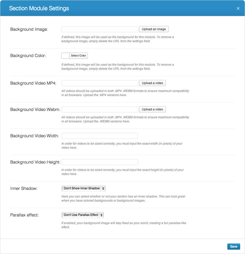
If you click on the settings link at the top of the Section’s blue bar you’ll be taken to the Sections Module Settings, which displays the various options available.
There are currently eight options available as shown on the screenshot below:

Most of the options are straightforward, but we’ll run through them and explain what each of the settings is, what it does and if there is anything you need to be aware of:
- Background Image – you can add an image url here, which will display as the background for this Section. To remove the background image, simply delete the URL from the settings field.
Section background images span the width of the browser so Elegant Themes recommend that background images are at least 1080px wide.
- Background Colour – you can define a solid background colour here either by using the built-in colour picker or adding the “hex” number of your colour.
- Background Video MP4 – videos should be uploaded in both .MP4 and .WEBM formats to ensure maximum compatibility in all browsers and this is where you upload the .MP4 version.
Video backgrounds are disabled for mobile devices, your background image will be used instead. You should therefore define both a background image and a background video to ensure best results.Note: In order for the MP4 video format to work in all browsers, your server must have the correct MIME types designated. If you notice that your videos are not playing in certain browsers, this is probably the reason.
- Background Video WEBM – this is where you upload your video in .WEBM format. All the notes above for the videos in .MP4 format apply to your video in .WEBM format.
- Background Video Width and Height – for your videos to be sized correctly, you must input the exact width (in pixels) and the exact height (in pixels) of your source video in these two input fields.
- Inner Shadow – select if you want to apply an inner shadow to your Section. You can play around with this and see which looks better: with or without inner shadow.
- Parallax Effect – enabling this option gives your background images a fixed position as you scroll. When this setting is enabled, your images will scale to the browser height.
NOTE: if you enable the parallax effect, Elegant Themes recommend that your images are at least the size of a standard screen size since your images will take on the width or height of the browser window (i.e. 1280px by 768px)
Full width Sections: For full width Header and full width Slider Modules
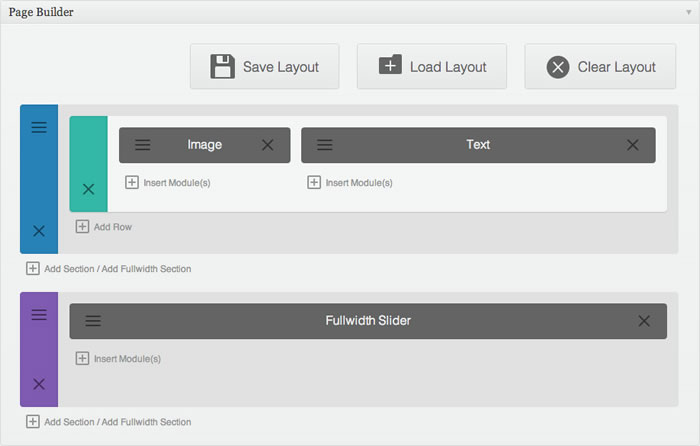
Sections come in two types: normal Sections and full width Sections. You don’t use rows in full width Sections, you use full width modules.
To help you spot the difference, normal Sections have a blue side panel and full width Sections have a purple side panel – see the graphic below:

At the moment there are two full width modules, which can be used inside full width Sections: full width header and full width slider but who knows what the release of Divi 2.0 will bring!
Divi 2.0 is on the way with even more goodies!
Divi 1.0 shipped with a total of 2 section types, 11 row structures, 6 column widths, and 17 modules. In Divi 2.0 we are setting our sights on increasing these numbers and delivering an even more robust Divi. At the end of the day, the content of your website matters the most, so we are working hard on improving the quality and quantity of modules that ship with the Divi Theme… watch this space!
Nick Roach – Elegant Themes
Pick up your copy of Divi and discover the creative power of Divi Sections
Like I said at the beginning: “…don’t worry, if you think that Sections are boring and that Modules are where you get creative… by the end of this post you’ll realise just how creative you can get with Sections.”
So here we are at the end of the post and I hope that you now appreciate how powerful Sections are, how creative you can get with them and that you’re straining at the leash to have a go yourself.
To get your copy of the Divi theme, sign up with Elegant Themes and get access to all their themes including Divi plus access to their support forum. And if you have second thoughts, don’t worry, your purchase comes with a rock solid 30 day money back guarantee. If you’d like your money back, just send them an email.
Fullwidth Beauty: Divi’s full width Section attributes allow you to build truly amazing pages. With fullwidth images, videos, colour backgrounds, and a little bit of imagination, the possibilities are countless.
Nick Roach – Elegant Themes
Hope that you enjoyed the post folks and I hope that Nick’s video has shown you just how easy it is to get creative with Divi Sections and the Parallax effect.
If you have any thoughts about Divi please leave a comment and if you’d like to spread the word about this fabulous theme please use the social icons below.
Credits:
My thanks and gratitude to Elegant Themes for the video and graphics used in this post.


