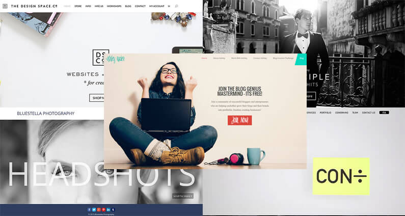
I came across a fabulous post last week called 75+ Stunning Examples of Elegant Themes’ Divi WordPress Theme in Action and believe me folks, it is one awesome collection of fabulous Divi theme websites.
All of the websites featured are mini works of art, but as you browse through the article you’ll find yourself picking out your favourites: the ones that catch your eye, the ones that you wish you’d produced, the ones that refuse to be ignored.
So If I asked you to pick your top five, which ones would you choose?
Would you go for the ones featuring real people, would you choose the ones with subtle black and white imagery or would you pick the ones featuring cool videos?
One thing is sure: we wouldn’t all pick the same five!
In this post I’m going to share my favourite five and say a little about why I picked each of them and then… you can all disagree with me!
My Affiliate Links Disclosure
Hi everyone. Just to let you know that many of the links on this site are my affiliate links. What that means is that if you click one of them and buy something… I get a commission. It doesn’t cost you anything extra and I only recommend things that I’ve tried and tested, so please, please, please… use my links.
#1 – A real attention grabbing beauty of a Div website
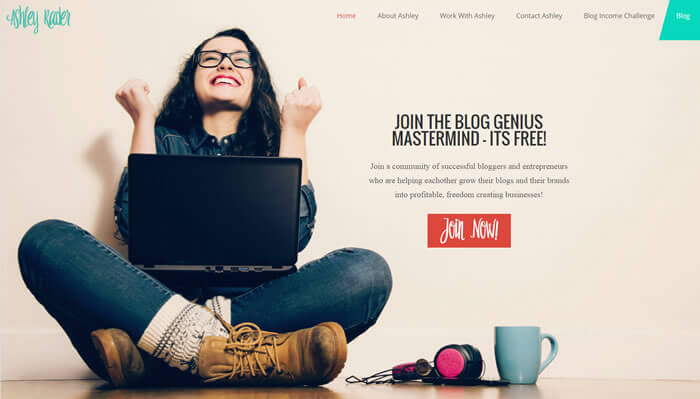
Ashley Rader
Great graphic, super clear navigation, short snippet of text, which tells you straight away what the site is all about and an eye-caching “call to action” via a nice bright orange button.
I love the colours, I love the spacing of the various elements and I love the fact that I smile every time I land on this site.
What would I change?
Both the Ashley Rader logo and the Join Now button use a great looking fun font, but they are difficult to read.
I would replace the font with one, which still had style, but was easier to read.
#2 – A Divi site where so little, says so much
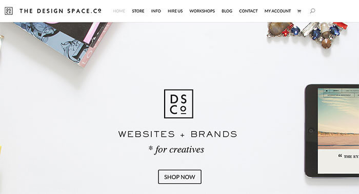
The Design Space
When you land on the Design Space homepage, everything you need is there: clear navigation, a short message telling you what the website is all about, good examples of types of branding, a “SHOP NOW” button giving you a direct call to action and it’s all floating in an ocean of whitespace.
This is a great example of a site, which is an advert for its own services.
The branding logo in the navigation bar and the centre of the screen, the various branded objects, and the words, which say “WEBSITES + BRANDS * for creatives” all do their job perfectly.
Who wouldn’t want branding or website design services from a site that looked this good!
What would I change?
Any changes to this site would just be “tinkering” so in this case… I wouldn’t change a thing!
#3 – A Divi site that uses black and white to add a little colour
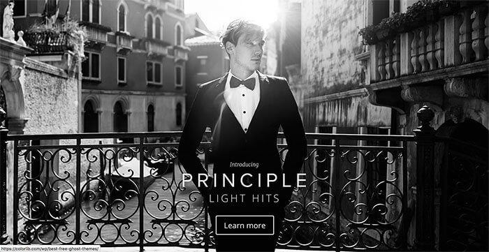
Lens Distortions
Using black and white imagery is easy, but only when it’s done right, and boy does this site do it right.
Not only does the homepage image ooze elegance and sophistication but it also illustrates one of the “lens flares available to Photographers” that is one of Lens Distortions’ products.
The text on the homepage is kept to a minimum with only the name of one of their products, Principle Light Hits, and a Learn more link.
What would I change?
I had trouble deciding what this site was about. I had to navigate to another page to find the strap line: “Principle Light Hits features some of the most beautiful, elegant lens flares available to photographers today.”
That line tells me exactly what the site is about and I would put it on the homepage.
#4 – A Divi site where two become one and bold simplicity says it all
Bluestella Photography
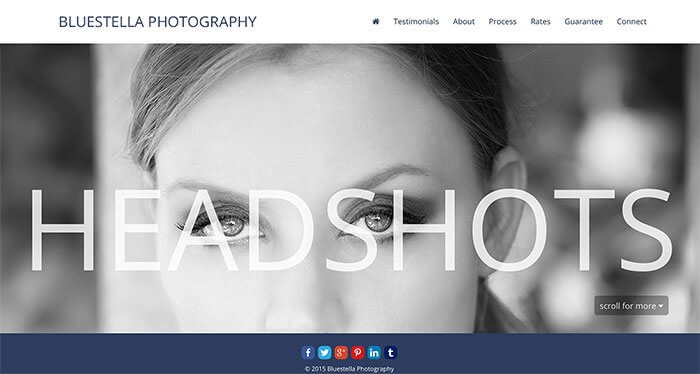
This is a one-page website, which presents you with only two major elements when you arrive at the homepage: the word HEADSHOTS and a headshot graphic. The word HEADSHOTS tells you exactly what the site is about and the headshot graphic shows you an example of their work… what more could you want?
Using such a large font size for the text and making it semi transparent allows you to see the graphic through the font and blends the two elements together perfectly.
What would I change?
I did say that this site “presents you with only two major elements when you arrive at the homepage” but there is a further element, a line of social share icons below the header graphic.
I think that this detracts from the two main elements and I would place them further down the page.
#5 – A Divi site with a header video…. and oh what a video
Condiviso
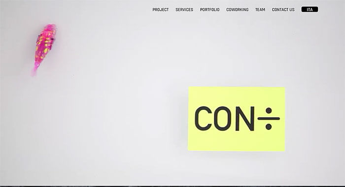
A menu bar, a yellow sticky label and an animated pink fish with yellow spots… that’s all you’ll find on this site’s homepage and the result is stunning.
Whoever put this one together is a creative genius, but in order to get the full viewing experience you really have to visit the site yourself.
This site was the Elegant Themes’ Winner Of The 2014 Customer Showcase Contest and that makes it just a little bit special.
What would I change?
The quirkiness of this site is what makes it both unique and memorable and I for one wouldn’t dare to change a thing.
My top 5 Divi sites from a choice of 75+
There you have it folks, out of 75+ top drawer Divi theme websites, those are my top five.
As I said at the beginning “One thing is sure: we wouldn’t all pick the same five!” and that’s no problem, but one thing we will all agree on is that the Divi theme allows you to create stunning and unique websites that are only limited… by your own imagination.
If you’d like to harness the power of Divi to create your own site or sites for your clients, then sign up with Elegant Themes, download your copy of Divi and maybe next year one of your sites will feature as one of my top five.
Add the power of the Divi Builder to your site… whatever theme you use!
If you want to add the power of the Divi Builder to your WordPress website, but you want to keep your existing theme, then you need the Divi Builder plugin.
The Divi Builder is a plugin, which works with any WordPress theme and allows you to add all the Divi Builder’s functionality to your website.
This is an example of a page created with the Divi Builder plugin, on a Genesis theme website.
I hope that you enjoyed the post and that it’s given you a few ideas of what can be achieved using Divi and fired up your enthusiasm for working on your own sites.
If you have any thoughts about Divi in general or these stand out Divi sites in particular, then please leave a comment and if you’d like to spread the word about this fabulous Drag and Drop theme, please use my social sharing icons below.
Credits:
My thanks and gratitude to the guys over at Winning WP for their 75+ Stunning Divi theme examples.
