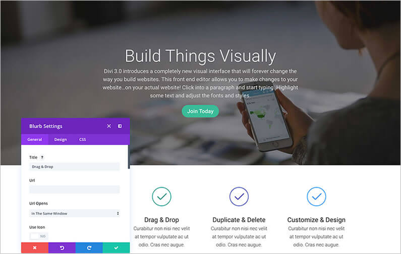
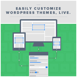
That’s right, with the release of Divi 3.0 and its Visual Builder, you can now create and edit your pages and posts… on the front-end of your website!
Of course if you don’t want to use the Visual Builder you can still use the standard “Back-end Builder” but believe me, once you’ve sampled the delights of editing on the front-end of your website, the back-end editor may seem rather tame.
In this post I’ll introduce you to the Visual Builder, show you how to activate it, remind you of the basic building blocks of Divi and how to configure and Customise them, look at creating a page and explain how to save time by using premade layouts and how to save your own pages to the Divi library.
At the end of this post you’ll be chomping at the bit to upgrade to Divi 3.0, activate the Visual Builder and start creating and editing your pages and posts on the front-end of your website.
My Affiliate Links Disclosure
Hi everyone. Just to let you know that many of the links on this site are my affiliate links. What that means is that if you click one of them and buy something… I get a commission. It doesn’t cost you anything extra and I only recommend things that I’ve tried and tested, so please, please, please… use my links.
So what is the Divi Visual Builder and why should you be using it?
When Divi was first released I knew that it was going to be a real game changer.
Here was a genuine drag and drop page builder theme that removed all the layout restrictions imposed by other themes… it truly was a breath of fresh air in the WordPress community.
Divi’s drag and drop interface sits inside the WordPress back-end and replaces the standard WordPress page / post editor.
Although the interface looks fantastic and is easy and intuitive to use, it’s still a block-based representation of your website and you have to save your edits and go to your site’s front-end to see what those edits actually look like.
The Divi Builder comes in two forms: The standard “Back-end Builder” and the front-end “Visual Builder.”
Both interfaces allow you to build exactly the same types of websites with the same content elements and design settings. The only difference is the interface.
The new Visual Builder, on the other hand, allows you to build your pages on the front-end of your website, on the actual pages and posts.
When you add content or adjust design settings inside the Visual Builder, your changes appear instantly.
You can click onto the page and just start typing. You can highlight text and adjust its font and style. You can add new content, build your page and watch everything happen in real time right before your eyes.
The new Visual Builder is quicker, more precise and it’s a great user experience and that’s why you should be using it.
If you’re still not sure if the Visual Builder is for you, then take a look at this video by Nick Roach of Elegant Themes, which looks at the Visual Builder interface in detail and covers everything that I’ll be covering in this post.
If this doesn’t convince you… then nothing will.
First step: enable the Visual Builder from the back-end or front-end of your site
In order to work with the Visual Builder, you have to enable it and in order to enable it you have to be logged in to your WordPress website.
note: in order to use the Visual Builder, you must first be using the Divi Builder for your page or post.
Enabling the Visual Builder from the back-end
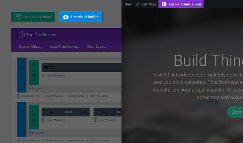
From the back-end of your site (your WordPress dashboard), you can enable the Visual Builder by clicking the “Use Visual Builder” blue button that sits at the top of the Divi Builder interface.
Enabling the Visual Builder from the front-end
Whilst you are logged in to your WordPress dashboard, navigate to any page on the front-end of your website and click the “Enable Visual Builder” button in the top WordPress admin bar.
A reminder of the Divi Builder building blocks: Sections, Rows and Modules
Before we look at building a page using the Visual Builder, here’s a quick reminder of the basic building blocks used to create a page using the Divi Builder.
Divi’s three main building blocks are Sections, Rows (which contain Columns) and Modules and using them in combination allows you to create just about any layout you can think of.
Sections
Sections are the basic and largest building blocks used in Divi layouts. They are used to create large groups of content, and they are the first thing you add to your page.
There are three types of sections: Regular, Specialty and Full Width.
Regular sections are made up of Rows of Columns, Full Width Sections are made up of full width Modules that expand the entire width of the screen and Specialty Sections are used to create more advanced sidebar layouts.
Rows
Rows sit inside Sections and you can place any number of Rows inside a Section.
When you create a Row you specify how many Columns it will contain and once you define a Column structure, you can place Modules into the desired Columns.
There is no limit to the number of Modules you can place within a Column.
Modules
Modules are the content elements of your page and Divi comes with over 40 different elements that you can use to build with.
You can use basic Modules such as Text, Images and Buttons, or more advanced Modules like Sliders, Portfolio Galleries and eCommerce Shops.
Every Divi Module can fit into any Column width and they are all fully responsive.
The graphic below shows a page layout as it is presented in the Divi Builder interface back-end.
The Sections have a blue tab, the Rows have a green tab and the Modules are shown in grey.
Note: the blue, green and grey colour coding is also used to identify Sections, Rows and Modules when you use the Visual Builder.

Building your first page with the Visual Builder
Whether you’re using the “Back-end Builder” or the front-end “Visual Builder”, you build your pages and posts using the three basic building blocks: Sections, Rows and Modules.
First you add Sections, then Rows and then Modules… blue Sections, green Rows and grey Modules.

#1 – Adding your first Section
The first thing to add to your page is a Section, which are added by clicking the blue (+) button.
When you hover over an existing Section, a blue (+) button will appear below it. If you click the blue (+) button, a new Section will be added below the Section you are currently hovered over.
note: when you start a brand new page, your first section is added automatically by the Divi Builder.

#2 – Adding your first Row
Now that you have a Section you can start to add rows and define how many columns each row has.
A section can house any number of rows, and you can mix and match rows of varying column types to create a variety of layouts.
To add a row, click the green (+) button inside of any empty section, or click the green (+) button that appears when hovering over any current row to add a new row below it.
Once you have clicked the green (+) button you will be presented with a list of column layouts. Choose the column layout that you want and the Row complete with Columns will be added to the Section.

#3 – Adding your first Module
Now you have a Section containing a Row, which contains Columns, you can start to add Modules.
Modules are added to the Columns inside of Rows and each Row can house any number of Modules.
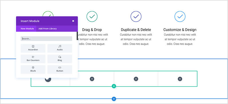
To add a Module, click the grey (+) button that exists inside of any empty Column or click the grey (+) button that appears when hovering over a Module on the page, to add a new Module below it.
Once you’ve clicked the button, you will be greeted by a list of Modules.
Pick the Module you want and it will be added to your page and the settings panel for that particular Module will appear.
Using this settings panel, you can configure your Module.
Configuring and customizing Sections, Rows and Module
Each Section, Row and Module can be customized via the elements “settings panel”.
You can access an element’s settings panel by clicking the gear icon that appears when you hover over any element on the page.
Each settings panel has three tabs: General, Design and CSS.
As a basic rule, everything you need to build a great website can be found in the General tab. Here you can do things like adjust a module’s content and layout, and even apply some basic design settings like font colours and background colours.
If you need additional design control, you can head over to the Design tab. Here you can customize absolutely everything about the element.
Finally, if you want even more control you can use the CSS tab and apply custom CSS to any part of the element.

Saving your Page and accessing Page Settings
To access general page settings, click the purple dock icon at the bottom of your screen.
This will expand the settings bar and provide you with various options.
You can open up your page settings by clicking the gear icon.
Here you can adjust things like page background colour and text colour. You will also find the Save and Publish buttons as well as responsive preview toggles.

Jump-start your design with Pre-made Layouts via the Divi Library
One of the great things about Divi is that it comes with over 20 pre-made layouts, which are a great way to jump-start your new page.
Divi pre-made layouts cover most common page types including: “About Us,” “Contact,” “Blog,” “Portfolio” and a whole lot more.
You can load these up and then swap out the demo content for your own and your new page will be finished before you know it!
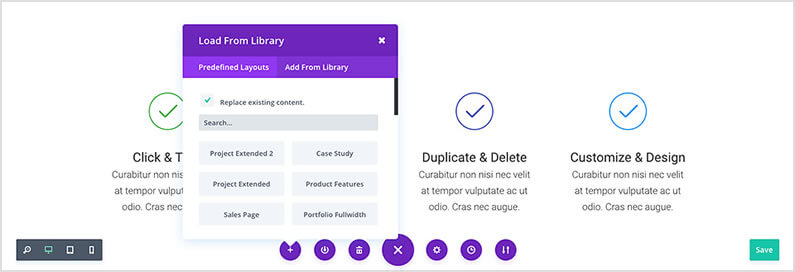
To load a pre-made layout, click the purple dock icon at the bottom of your screen and click the (+) icon, which brings up the “Load From Library” dialogue box.
You can choose to import a new page and replace your existing page or import a new page and add it to your existing content.
Saving your own layouts to the Divi Library
In addition to using the pre-made layouts that come with Divi, you can also save your own creations to the Divi Library.
When a design is saved as a Divi Layout in the Divi Library, it can be loaded onto new pages.
You can then use your existing designs as the framework for new designs, which saves both time and effort.
To save an item to the Divi Library, click the library icon that appears when hovering over any element and within the page settings bar.
Once an item has been added to the library, it will appear in the “Add From Library” tab when adding new Divi Layouts, Sections, Rows and Modules.

With Divi 3.0’s Visual Builder you can make changes instantly… without ever leaving the page you’re working on
I’ve been using Divi 3.0’s Visual Builder for only a few days and it’s already beginning to transform the way I build and edit websites.
It’s made the whole process quicker, easier and much more intuitive and most importantly… it’s put the fun and excitement back into web design.
Just to remind you of the delights of working on the front-end of your website using the Visual Builder, here’s a short video to whet your appetite.
If you’d like to swap “content creation” in the back-end of WordPress for “creative designing” on the actual pages of your website, then hit the big green button below, sign up with Elegant Themes and start using the Divi 3.0 Visual Builder today.

Create your WordPress masterpiece with Divi 3.0’s Visual Page Builder
I hope that you enjoyed the post and that you are as excited about Divi 3.0 as I am.
If you have any thoughts about the Divi theme in general or the Divi 3.0 Visual Page Builder in particular, then please leave a comment and if you’d like to spread the word about this fabulous On-Page theme, please use my social sharing icons below.
Credits:
My thanks and gratitude to Elegant Themes for the videos, graphics and details of Divi 3.0 used in this post.
