Prior to Divi 2.4, you could only have a four column footer… even if that wasn’t what you wanted.
Divi 2.4 now gives you a completely revamped Footer Customizer, nine Footer Column Layouts, Widget Text Styling, Footer Menu Control and a choice of Footer Bottom Bar styles.
By mixing and matching the new Footer Layouts and styling options you can really get creative with your footers.
This is the fourth in a series of posts designed to help you become familiar with the new features of Divi 2.4, to give you ideas on how and where to use them in practical web design situations and to provide you with resources to help build your Divi Library.
Be sure to check out the other posts in this series:
All you need to know about Global Library Items
Advanced Design Settings and a FREE Library Pack
Create gorgeous Blog Posts with the Divi Builder
My Affiliate Links Disclosure
Hi everyone. Just to let you know that many of the links on this site are my affiliate links. What that means is that if you click one of them and buy something… I get a commission. It doesn’t cost you anything extra and I only recommend things that I’ve tried and tested, so please, please, please… use my links.
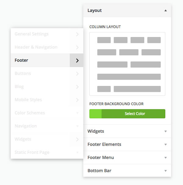
The completely revamped Footer Customizer
The Footer section of the Divi Theme Customizer has been completely revamped in Divi 2.4, and I do mean completely.
There are now separate sections for:
- Column layout – choose from nine column layouts and set your footer background colour
- Widgets – widget text style settings
- Footer elements – toggle your social icons on and off
- Footer menu – text styling of your footer menu
- Bottom bar – controls for styling the bottom footer bar
That is one glorious revamp for customising your footer and footer bottom bar. The only bad news is, you won’t have any excuse for not having a great looking footer.
You now have nine footer column layouts to choose from
Once there was one and now there are nine.
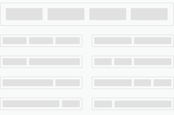
That’s right folks, eight new footer column layouts have been added in Divi 2.4 so there’s something for everyone and whichever column layout you choose, you can still display up to four widgets.
If you only have 2 or 3 widgets, or if you want to display all of your widgets in a 2 or 3 column layout, all you have to do is change your footer layout in the Footer section of the Theme Customizer.
The screenshot below shows the nine footer column layouts you can choose from and I’ll look at each in more detail, and show a few examples, at the end of the post.
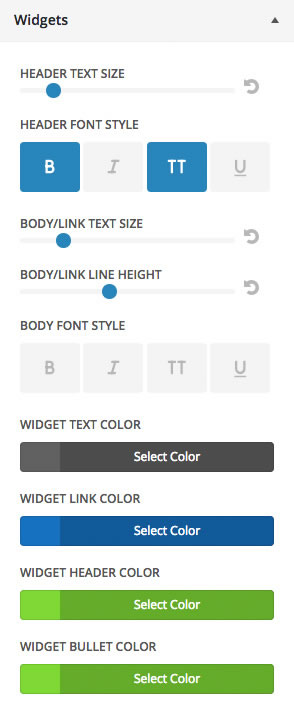
Widget text styling
Your footer background colour, text styles, and overall colour scheme of your site all influence which footer text styles you should choose.
Since Elegant Themes have no idea what those colours and styles will be on your particular site, they’ve handed the control over to you with a new set of widget text style settings.
As you can see from the screenshot below, the styling options for the text are pretty comprehensive.
Footer Menu control
In your WordPress Menus tab, you can assign any menu of your choice to appear in your footer. This can be a useful alternative to adding a Pages Widget or back-to-top button and allows your visitors to access the menu from the bottom of a page or post.
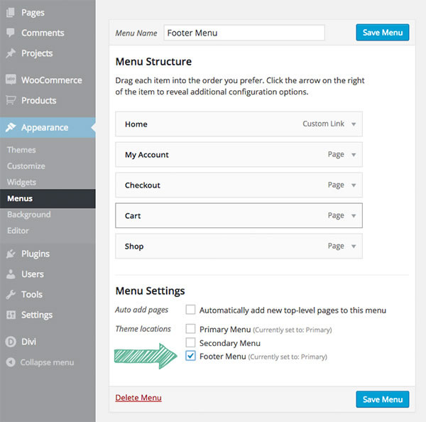
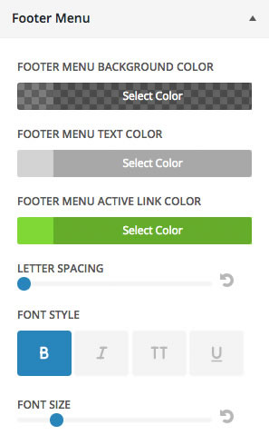
Just like the widget typography settings above, you also have full control over the text styling of your footer menu.
And once again, as you can see from the screenshot below, the styling options cover just about everything.
Footer Bottom Bar styles
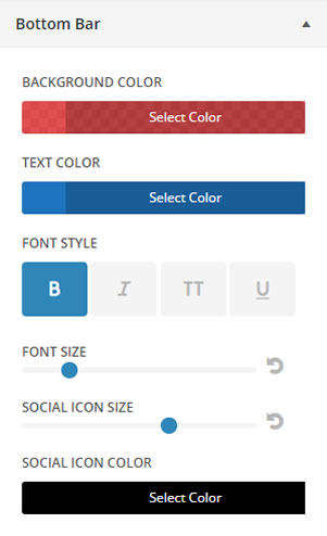
The Footer Bottom Bar is the narrow strip right at the bottom of your pages and posts, which contains the website credit links and any social links you have enabled.
The Footer Customizer allows you to customize the Bottom Bar via the controls shown below.
Footer ideas that you can use on your own sites
The new footer features are great on their own, but when you combine them, that’s when the magic begins.
The ability to adjust text sizes, text colours and background colours means that you can create a footer that stands out from your site’s main content, but still has compatible colours and typography.
Being able to choose transparent background colours for your footer menu and bottom footer bar allows you to create a harmonious colour scheme based on your overall footer colour.
Let’s take a look at a few footer column layouts, see when they are appropriate and take a look at a few screenshots of examples.
1/4 : 3/4 layout
Perfect for adding your logo into the 1/4 column and a block of text in the 3/4 column as used in the example below.
For the 3/4 column you could also use the Recent Blog Post widget, the Monarch Social Follow widget, or other third party widgets.
1/3 : 1/3 : 1/3 layout
Similar to the default equal-fourths layout, but more convenient if you only have three widgets and/or want your widgets to be a little wider for more content.
The 1/3 columns are a good width for any kind of widget, text, an image, or a list of some sort.
1/2 : 1/2 layout
A good layout if you have more than two widgets but still want wide columns.
The 2 column example below uses all four widgets, which is the maximum you can display, whichever layout you use.
1/3 : 2/3 layout
Similar to the 1/4 : 3/4 layout, but gives you a little more width in the first column for something like an image/logo with a wider aspect ratio or a smaller chunk of text.
1/4 : 1/4 : 1/2 layout
A versatile layout in terms of column widths with two narrow columns and one medium sized column, and if you place a fourth widget, it will span the width of the footer below the first row of widgets.

To find your perfect column ratios, play around with the various layouts and column widths until you find the one that best fits the needs of your footer content and that’s the one for you.
These options make it easy for you to create a great looking footer design for your particular content, and give your footer its own unique look.
Pick up your copy of Divi 2.4 and start creating those gorgeous footers
No more excuses for neglecting your footers, the new features in Divi 2.4 give you complete control over both layout and styling.
Choose the column layout, add a menu, style the main footer, menu and footer bar and create stunningly good looking footers, each of which is truly unique – your footers will never be boring again!
If you’d like to join the Divi community and start creating your own unique footers, then sign up with Elegant Themes, download your copy of Divi and start creating those fabulous footers.
The Elegant Themes team had already far surpassed every expectation I had when I joined 5.5 years ago. Now, with Divi 2.4, just about everything I could need is here. Thanks Nick & ET team!
BarbaraP – Elegant Themes blog comment
I hope that you enjoyed the post and that it’s given you a few ideas for using Divi 2.4’s Footer options to create your own unique footers.
if you have any thoughts about Divi 2.4’s new features in general or the footer layout and styling options in particular, then please leave a comment and if you’d like to spread the word about this fabulous Drag and Drop theme, please use my social sharing icons below.
Credits:
My thanks and gratitude to Elegant Themes for the graphics and details of Divi 2.4’s footer options used in this post.
