Put your hand up if you’ve never heard of RGBa colour values… don’t worry neither had I, until Divi 2.4.
Divi 2.4 comes with new colour pickers with alpha controls, which allow you to select and input RGBa colour values.
And the great thing about RGBa colours is that not only can you pick colours but you can also add transparency to those colours.
With transparency you can create a cohesive colour Palette, make your modules stand out against a background image, create a transparent contact form and add full or semi-transparent background colours to your navigation header.
This is the eighth in a series of posts designed to help you become familiar with the new features of Divi 2.4, to give you ideas on how and where to use them in practical web design situations and to provide you with resources to help build your Divi Library.
Be sure to check out the other posts in this series:
All you need to know about Global Library Items
Advanced Design Settings and a FREE Library Pack
Create gorgeous Blog Posts with the Divi Builder
Get creative with Divi ‘s new Footer Layouts
The Code Modules for shortcode and HTML integration
New Header and Navigation styles and formats
The new options for Rows and how to use them
My Affiliate Links Disclosure
Hi everyone. Just to let you know that many of the links on this site are my affiliate links. What that means is that if you click one of them and buy something… I get a commission. It doesn’t cost you anything extra and I only recommend things that I’ve tried and tested, so please, please, please… use my links.
Colour definitions and the new Colour Pickers complete with Alpha Sliders
Let’s start by looking at colour definition using RGBa values.
RGBa is a colour value that is defined by its RGB value plus an alpha value, which is what the ‘a’ stands for. You can think of the alpha value as an opacity value.
Let’s take a look at an example:
Black can by represented by: #000000; or rgb(0,0,0); or using the rgba method: rgba(0,0,0,1); where the 1 represents its opacity on a scale of 0 to 1.
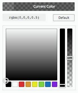
Using this scale we can create a 50% transparent black with rgba(0,0,0,0.5) as shown in the screenshot below.
Note: The alpha slider is the slider on the RHS of the colour picker and the checkerboard effect is the traditional way to represent transparency.
Transparent colours play nicely with coloured backgrounds
One of the useful features of transparent colours is that they play nicely with coloured backgrounds.
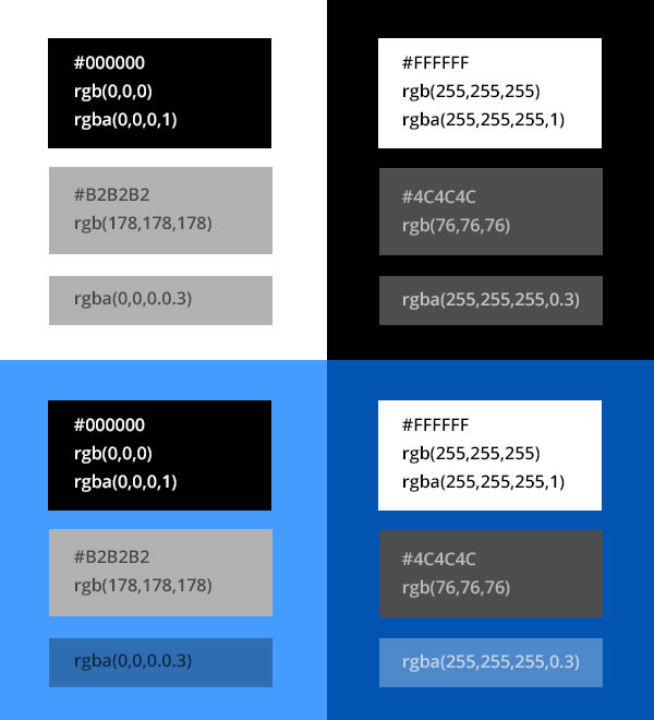
You can see from the graphic below that true black on true white (upper left) and true white on true black (upper right) produces too much contrast and is hard on the eyes.
Light and dark grey are more soothing and would be a good alternative to black and white… until you start adding coloured backgrounds.
Semi-transparent black looks the same as a light grey when it’s on a white background (upper left), and semi-transparent white looks the same as a dark grey when it’s on a black background (upper right).
But semi-transparent black on light blue looks dark blue (lower left) and semi-transparent white on dark blue looks light blue (lower right).
The whole effect is more visually pleasing and easier on the eyes and it allows you to create some super cool effects such as the ones below.
The golden rule of Semi Transparent overlays
If you got lost in all the talk of colours above, try this:
If you’re overlaying one colour on top of another colour, say a Module background colour on a Section background colour and you want the Module colour to be slightly darker than the Section colour, then use a semi-transparent black.
If you want the Module colour to be slightly lighter than the Section colour, use a semi-transparent white.
Hope that helps.
Transparent colours are perfect for Module backgrounds
Divi 2.4 Modules now have a Background Colour setting under their Advanced Design tabs. The settings vary for each Module but here are a few examples where transparent backgrounds work perfectly.
Use transparent backgrounds for slider slides
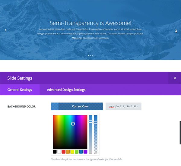
The example below uses a transparent background colour for each slide in the slider plus a background image to the Section. The result is that the Section background image shows through the transparent slides and creates a cool looking effect.
The settings used for the transparent background colour, for the slide, is shown beneath the example.
Transparent Module background colours allow you to create a cohesive colour palette
Adding modules with a background colour to a Section that has a background colour can be difficult because the two colours have to work together.
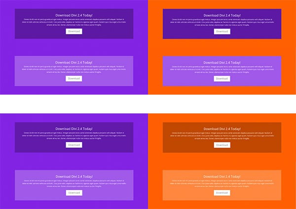
And even if you find the perfect combination of colours, you have to start all over again if you change your Section’s background colour as in the upper right image below.
A great way to get round this problem is to use semi-transparent background colours on your Modules.
If you want your Module background colour to be slightly darker than the Section colour, use a semi-transparent black. If you want it to be slightly lighter than the Section colour, use a semi-transparent white.
The lower right image below uses 25% black and 25% white for the Module background colour.
Going all the way… create a fully transparent contact form
I know what you’re thinking…. when would you ever want to use full transparency?
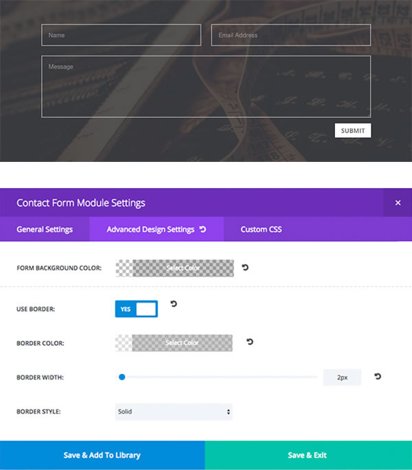
The Contact Module is a good example of a module that looks great when you use full transparency and add a border using Divi’s new border options.
The example below uses a fully transparent background plus a semi-transparent border colour so that a bit of the background shows through.
The settings under the Advanced Design Settings of the Contact Form Module are shown beneath the example.
Make your text show clearly over a background image
There are lots of times when you want to overlay text on an image but, depending on the colours of the text and image, the text is not always easy to read over the image.
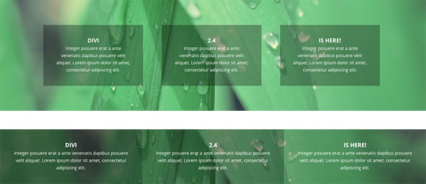
With alpha colour pickers all you have to do is add a Module background colour and the text stands out beautifully.
In the upper of the two examples below, 40px of custom padding has been added to each module so that the content has plenty of room to breathe and doesn’t touch the sides of the module.
Tip: If you use a transparent colour for your Module background and a parallax effect on your background image… it produces a super cool effect.
The upper of the two examples uses the same alpha value for all three Modules, the lower example uses different alpha values for each Module plus the Row has been made fullwidth, the column gutters have been removed and the Row and Section padding has been set to 0 for a true gutterless look.
Use full or semi-transparent background colours in your navigation header
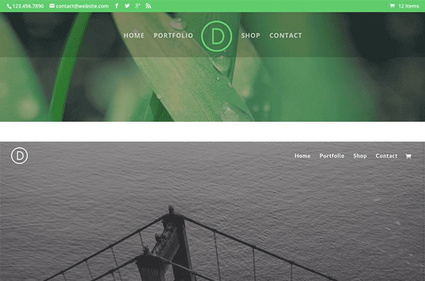
You can now add transparency to your navigation background colours and produce great effects like the two examples below.
You can read more about how to customise your header navigation in my post New Header and Navigation styles and formats.
Create hover overlays to match your accent branding colours
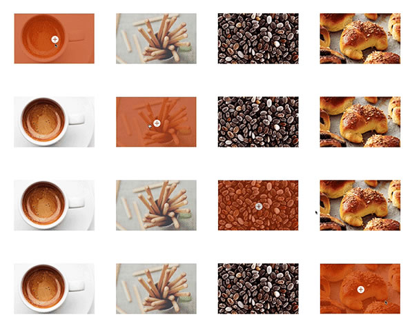
With the new alpha pickers customising the hover overlay of gallery images, portfolio projects, and shop products is a piece of cake.
If you want the overlays to match an accent colour of your brand, you can now choose a semi-transparent overlay colour for your hover state as shown in the image below:
And don’t forget your columns… even columns have feelings
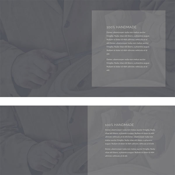
If you have multiple Modules in a Column and you want them all to sit on top of a Section background image, rather than giving each Module a background colour, you can save time by giving the Column they are in a semi-transparent background.
The first example below uses a Section with a background image, a two Column Row with a semi-transparent background colour for Column 2 and a Text Module in the right Column with a bit of custom padding to give the content plenty of breathing room.
For the lower example the Row has been made fullwidth, the Column gutters removed and the Row and Section given zero padding values.
Your turn to get creative with Divi 2.4’s new semi-transparent colours
The thing is, with Divi 2.4’s alpha pickers you don’t need to know anything about RGBa colour values in order to use semi-transparent colours and create stunning effects on your website… the colour pickers do it all for you.
Use the effects for your Module backgrounds, to create full transparency, to make your text stand out against images, to create gorgeous navigation headers, for hover effects that match your branding colours and anywhere else that your imagination takes you.
If you’d like to start using Divi 2.4 to add semi transparent colours to your layouts, then sign up with Elegant Themes, download your copy of Divi and start putting some of the ideas in this post into use on your own website.
I love the new background colors and transparency settings! I ESPECIALLY love the Background Color Overlay option in header images. It makes it SO nice and easy to add a splash of color without having to fire up Photoshop every time I need to make a small change.
David – Elegant Themes blog
I hope that you enjoyed the post and that it’s given you a few ideas for using Divi 2.4’s new semi-transparent colour picker options.
if you have any thoughts about Divi’s new features in general or the colour picker options in particular, then please leave a comment and if you’d like to spread the word about this fabulous Drag and Drop theme, please use my social sharing icons below.
Credits:
My thanks and gratitude to Elegant Themes for the graphics and details of Divi’s new Colour Pickers used in this post.


