This is the second in a series of posts, which will help you become familiar with the new features of Divi 2.4, give you ideas on how and where to use them in practical web design situations and provide you with resources to help build your Divi Library.
The first post covered Global Library items and if you want to catch up you’ll find it here: Divi 2.4: all you need to know about Global Library Items
In this post I’ll remind you what the Divi Library is and how it can supercharge your workflow, take a look at some of the Advanced Design Settings which are common to many items, play with the Advanced Design Settings for a few specific Divi Modules to create some fabulous effects and give you a link to download a FREE Library Pack, which includes some cool Library items including the ones described in this post.
My Affiliate Links Disclosure
Hi everyone. Just to let you know that many of the links on this site are my affiliate links. What that means is that if you click one of them and buy something… I get a commission. It doesn’t cost you anything extra and I only recommend things that I’ve tried and tested, so please, please, please… use my links.
The Divi Library is your friend… it can save you soooooo much time
The Divi Library is where you can save individual Modules, Rows, Sections or even entire layouts that you’ve created using the Divi Builder. The ability to save just bits and pieces of your layouts (as opposed to entire layouts) makes page building much, much faster.
Once an item has been saved to the Library, it can be accessed from within the Divi Builder and used when you create new pages or new websites for your clients.
In Divi 2.4 Sections, Rows, and Modules have their own sets of comprehensive Advanced Design Settings, which means that you can spend a lot more time configuring the various elements on your page.
But you don’t have to create these highly customised elements each time you want to use them, all you have to do is save them to the Library where you can access them whenever you need them.
This comprehensive video by Nick Roach of Elegant Themes runs you through everything you need to know about the Divi Library:
Advanced Design Settings in Divi 2.4… common settings worth knowing
Advanced Design Settings are different for each element but there are a lot of settings, which they share and that are worth becoming familiar with.
Knowing that these are available will allow you to speed up your workflow and help you become more creative with your website design.
- Custom Padding and Margin – create more white space and let your Modules breathe by giving them extra padding or margin. You can define padding and margin for the top, right, left, and/or bottom side of your Module.
- Custom Border – add a border around your Module by choosing a border weight, style and colour.
- Custom Buttons – define custom button settings on a Module by Module basis. This will override any site-wide button settings you may have.
- Background Colour / Image – add a background colour and / or image to individual Modules to create some truly stunning and unique effects.
- Text Options – configure your typography settings on a Module by Module basis. You can configure: font, colour, style, size, line-height, and letter spacing.
As you can see from the image below, you don’t have to be a developer to use these settings, they are presented in a great looking easy to use interface that anyone can understand and complete.
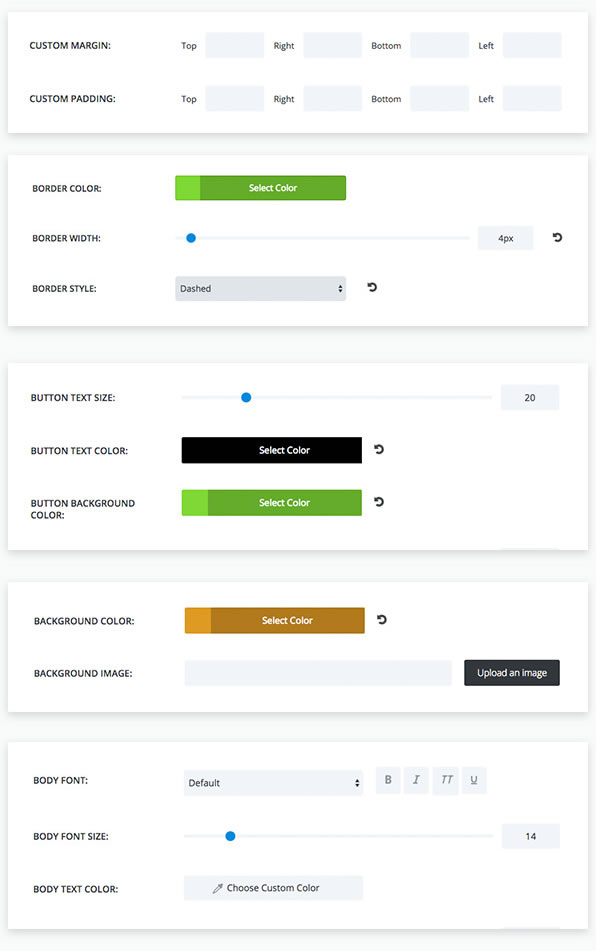
The Advanced Design Settings in Divi 2.4 give you much more control on an element by element basis, which gives you more scope to be creative.
Now that we’ve looked at the basics, lets take a look at what can be achieved by mixing and matching the settings for a few Divi elements.
Hopefully these examples will give you ideas for creating unique elements that you can use on your own sites.
#1 – A super cool transparent Contact Form
Most of us use a contact form on our websites so let’s start with the Divi Contact Form Module.
The new contact form settings in Divi 2.4 allow you to control, form background colour, border style, text colour, and form field rounded corners.
The example below is suitable for a dark page background. It has a transparent background colour, white border and rounded corners. The image behind the form is part of the actual page, not part of the contact form.
The free Library pack contains two transparent contact forms, one for a light background and one for a dark background.
You can of course customise all of these settings to match your own site’s colour scheme.

#2 – Pricing Tables with a touch of class
Configuring the Pricing Tables Module, to get just the look you want, can take some time. That makes it the perfect Module for adding to the Divi Library ready for reuse on other pages or sites.
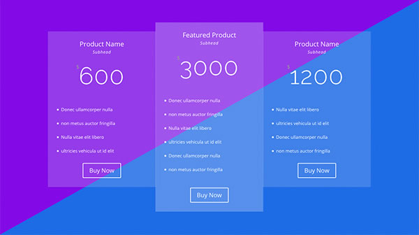
The example below is a modern styling of this Module and the split background colour has been used to illustrate that you can import this module into your own page and add it over any background colour that supports white text. The split background colour is not part of the Module.
The default borders have been removed, all text set to white, buttons modified to be white and transparency added to the table background colours.
The featured pricing table has also been given a more opaque background using the Module’s featured-table design settings.
Using the Advanced Settings, in the Pricing Table Module, you can customise the tables across the whole module or on a on a table by table basis. For example, you could give each table its own background colour to make each product really stand out.
#3 – Gutterless Rows for creating fabulous effects
Gutterless rows are new to Divi 2.4 and you may be wondering where and how to use them.
Just to get you started, the example below is a two Column Row that has been made fullwidth with no space between its Columns and as you can see… it looks pretty cool.

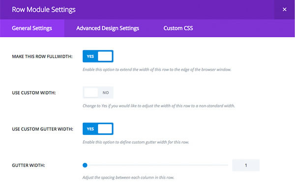
The Row Module Settings > General Settings below show how this configuration is achieved.
The important settings are:
General settings > MAKE THIS ROW FULLWIDTH > YES
General Settings > USE CUSTOM GUTTER WIDTH > YES (The GUTTER WIDTH is then set to zero)
The coffee image is a column background image and the columns will always remain the same height with Divi’s new Equal Column Height setting.
Also included in the Free Library Pack is this same row but with the image on the left. Combining the two creates a good looking alternating layout as shown below:
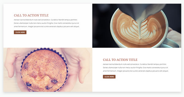
If you use the Free Library rows in your own layouts, the call-to-action module will inherit your theme’s typography and button styles.
How to save your own Items to the Divi Library
At some stage you’ll want to start saving your own items to the Divi Library and this is how you do it.
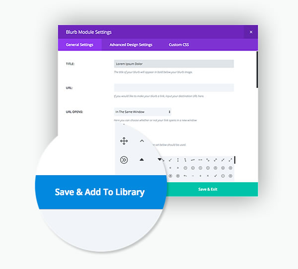
When creating or editing a new Module, Row or Section within the Divi Builder, you’ll see the standard “Save & Exit” button on the bottom of the settings windows plus a new button called “Save & Add To Library.”
When you click “Save & Exit” your Module settings are saved on the current page and the settings popup is closed.
When you click “Save & Add To Library,” the Module is still saved on your page, but it is also added to your Divi Library.
How to add Library Items to your Pages and Posts
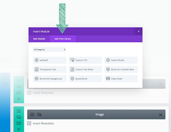
Once an item has been saved to the Divi Library it can be added to any page or post from within the Divi Builder by clicking the “Add From Library” button when adding a new module, row or section to the page.
Download the FREE Library Items Pack and add it to your own Library
To get your Free Library Items Pack, which includes the items described in this post and much much more, click this FREE Library Items Pack link and download the zipped file.
Unzip the downloaded file and save the resulting XML file – this is the file that you’ll upload to your own Library, not the zipped file.
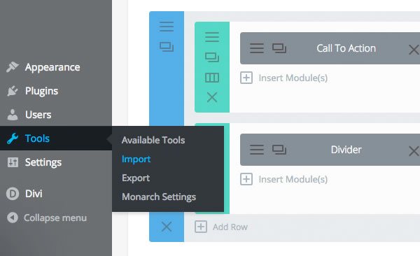
To import them into your Library, navigate to Tools > Import. Select the WordPress link at the bottom of import type list, and you will be prompted to upload the file – upload the XML file extracted above.
Before uploading: unzip the zip file, only XML files can be imported.
Pick up your copy of Divi 2.4 and your FREE Library Pack
Divi 2.4’s Advanced Design Settings allow you to style elements on an item by item basis and create fantastic looking effects that are unique to your site.
Combine this feature with the Divi Library and you have a combination, which allows you to create, save, access and reuse individual Modules, Rows, Sections or even entire layouts and supercharge your entire workflow.
If you’d like to join the Divi community and take advantage of the Advanced Design Settings and Library Items feature in Divi 2.4, then sign up with Elegant Themes, download your copy of Divi and start creating fabulous drag and drop websites using your personalised stock of Divi Library items.
just downloaded the new modules and played with the transparent contact form… WOW…. easy to make ’em really beautiful, without any skill on our part – Thanks!
Jim Van Wyck – Elegant Themes blog comment
I hope that you enjoyed the post and that it gave you an insight into using Divi 2.4’s Advanced Design Settings to create stunningly unique effects.
if you have any thoughts about Divi 2.4’s new features in general or the Advanced Design Settings in particular, then please leave a comment and if you’d like to spread the word about this fabulous Drag and Drop theme, please use my social sharing icons below.
Credits:
My thanks and gratitude to Elegant Themes for the graphics and details of Divi 2.4’s Advanced Design Settings feature used in this post.
