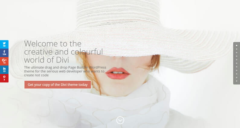
If you take a look at my homepage you’ll see that it’s made up of four main Modules: a Fullwidth Header Module, several Text Modules, several Blurb Modules and two Call To Action Modules.
There are a few other Modules, but the essential ones that are needed to create a good looking page that attracts visitors, provides information and is ranked well by the Search Engines, are the four above.
In this post I’ll explain what each of these Modules does, why it’s needed and suggest alternatives Modules that you can use to provide the same function.
My Affiliate Links Disclosure
Hi everyone. Just to let you know that many of the links on this site are my affiliate links. What that means is that if you click one of them and buy something… I get a commission. It doesn’t cost you anything extra and I only recommend things that I’ve tried and tested, so please, please, please… use my links.
#1 – the Fullwidth Header Module to grab and hold your visitors’ attention
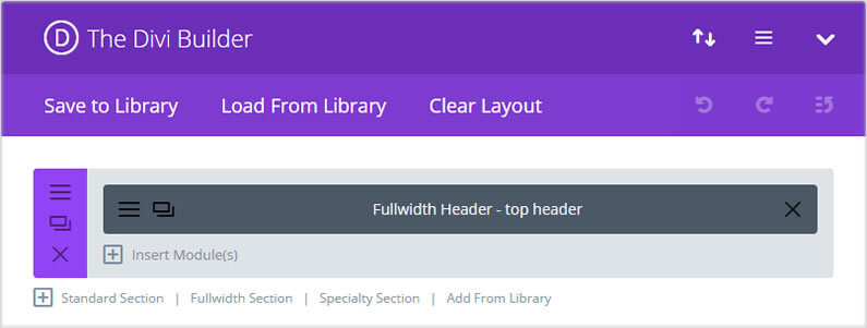
The Fullwidth Header Module is the perfect Module to grab and hold your visitors’ attention.
It allows you to add a background image, a heading, a section of text and a button, which you can use as an immediate call-to-action button.
Use an eye-catching image, play with the font and font sizes to produce a good looking visual effect and give the button a contrasting colour that your visitors can’t miss.
We live in a world of short attention spans. Attention span is the amount of time that a person can concentrate on a task without becoming distracted.
Since that task can be learning about your product, figuring out if your service is right for them – it’s *kind of* important. So you need to learn how to grab and hold website visitor’s attention.
8 Things That Grab and Hold Website Visitor’s Attention
Alternative Modules
As an alternative, you could use the Fullwidth Slider Module, which I’ve used on my Divi Imagery page.
#2 – the Text Module to create content for your visitors and the Search Engines
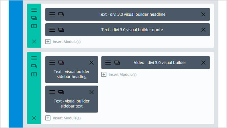
All websites need text and if you’re selling your goods or services, you absolutely need text.
But your text doesn’t have to be boring.
Use stylish font combinations, play around with different Column ratios (see screenshot above), use larger fonts for headlines, introduce the occasional Drop Cap, break up your text into small chunks and always leave oceans of whitespace around your text blocks.
The Divi text module allows you to do all of the above, and more.
Don’t forget the Search Engines
No matter how gorgeous your graphics are, the only thing that Google can read is text (it can also read graphics alt text so don’t forget to add meaningful alt text to all your graphics).
That means that whilst you write for your visitors, you must also bear in mind what your keywords and keyword phrases are for a particular page or post.
In short: write for your visitors and refine for the Search Engines.
Alternative Modules
Sorry folks, no alternatives to the all-conquering Text Module. Whichever way you look at it, your site has to have text.
#3 – the Blurb Module to break up your content and add a little fun
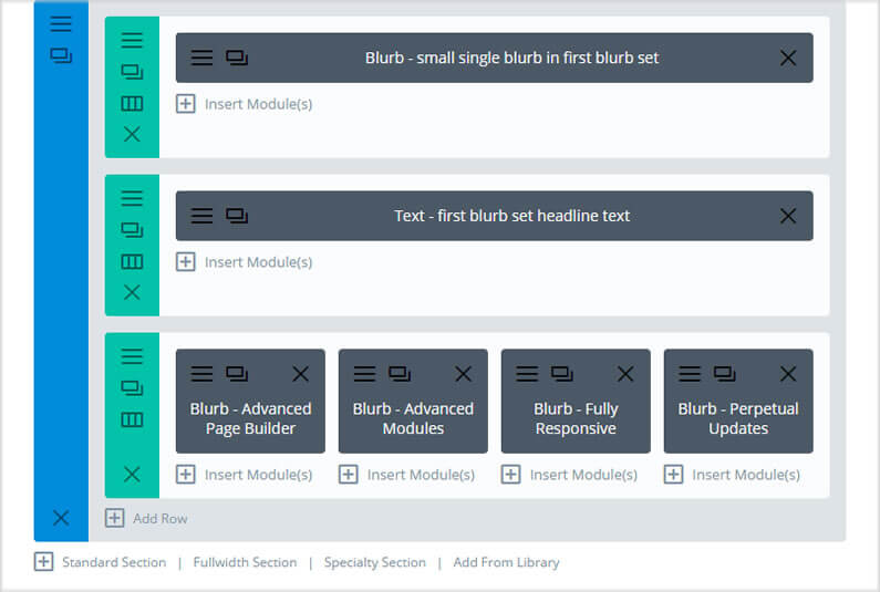
There’s nothing worse than landing on a webpage and being confronted with paragraph after paragraph of small font, closely spaced text!
Reading text on a screen is frustrating and tiring so you need to break up your text blocks with something visual and fun.
The Blurb Module is perfect for this because it combines a graphic with a headline and a short section of text.
For best results, keep the text short and use the Blurb Modules in combination – see the screenshot above where I’ve used four Blurb Modules in 1/4 width Columns.
Alternative Modules
A couple of great alternatives to the Blurb Module are the Bar Counters Module and the Circle Counter Module.
Both break up your text and both add a little fun animation, which helps to keep your visitors’ attention.
#4 – the Call To Action Module to make it easy for your visitors to buy your goods or services
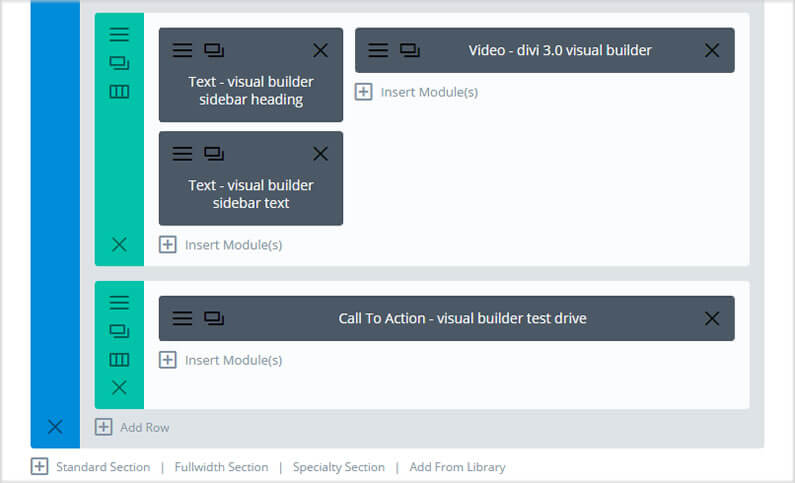
No matter how good your homepage looks, it still has to convert visitors into sales and that’s where the Call To Action Module comes in.
The Call To Action Module allows you to add a headline, a short piece of descriptive text and a button for your visitors to click.
Your job is to make that button so irresistible to your visitors, that they just have to click it.
You can do that with a combination of button text and colour and to that end you might want to read 6 Characteristics of High-Converting CTA Buttons.
Although the article mentions 6 characteristics, the three most important ones are:
- They have compelling copy.
- They have logical placement.
- They use a contrasting colour.
Alternative Modules
You can achieve the same effect as the Call To Action Module, using a Text Module in combination with a Button Module.
I’ve never used this combination, but it may provide more scope for layout alternatives.
Create your perfect homepage with just four Divi Modules
Just because Divi comes with 41 content Modules, it doesn’t mean that you have to use each and every one of them on all pages!
The principles of good design hold true, whatever theme you’re using: coordinated colour scheme, high quality eye-catching graphics, stylish font combinations and plenty of whitespace to break up your content into manageable chunks.
Hopefully I’ve demonstrated in this post, that all the principles of good design can be achieved with just a little imagination and four Divi Modules.
Permanent offer for 10% off Divi / Elegant Themes new memberships and account upgrades
If you’d like to create your perfect homepage using Divi, then please feel free to use our permanent 10% off discount below.
The deal applies to both new memberships (Developer license only) and account upgrades and you can take advantage of it anytime you like.

Get 10% Off New Memberships & Account Upgrades!
This is a permanent offer for new memberships (Developer license only) and account upgrades so even if you missed all the other Elegant Themes “time limited” deals… this one will always be waiting for you.
Credits:
My thanks and gratitude to Elegant Themes for offering this generous 10% off deal.
