Divi has always been ahead of the crowd when it comes to Drag and Drop WordPress Page Builders but when it introduced the Visual Builder, it left the competition in its wake.
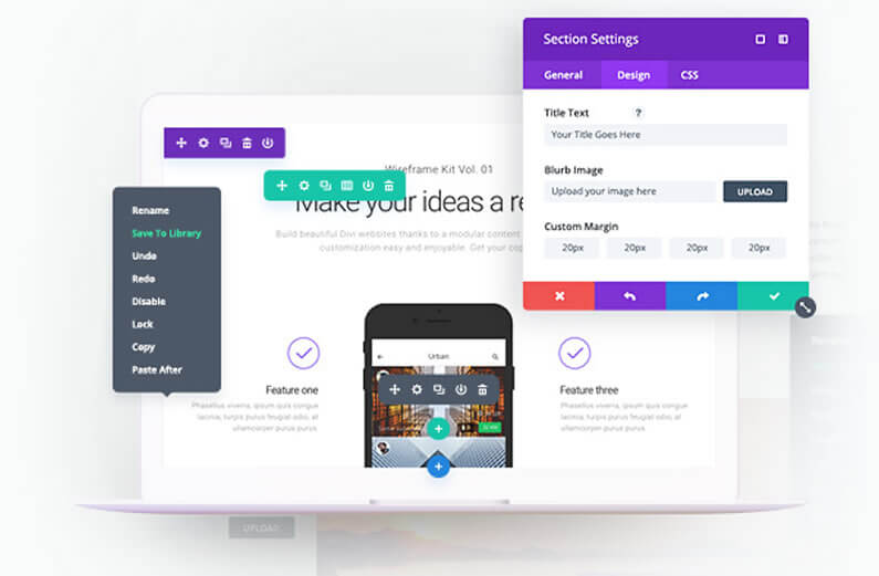
The Divi Visual Builder allows you to create and edit pages on the actual page and see the result almost instantaneously.
The first time you use the Visual Builder you really will believe that you’re in the world of “WordPress magic”.
But Elegant Themes haven’t been complacent and taken their marked dominance for granted, they’ve continually updated and improved the Visual Builder and added Community Driven new features.
In this post I’ll take a look at the latest improvements / updates and explain what each adds to the ease of use and effectiveness of the Visual Builder.
My Affiliate Links Disclosure
Hi everyone. Just to let you know that many of the links on this site are my affiliate links. What that means is that if you click one of them and buy something… I get a commission. It doesn’t cost you anything extra and I only recommend things that I’ve tried and tested, so please, please, please… use my links.
#1 – The new blazing fast Divi Visual Builder powered by React 16

Divi’s Visual Builder is built on the React Javascript library and the React version has now been updated to React 16.
Using React 16 produces performance improvements along with new tools, which will allow Elegant Themes to build an even better, and faster, piece of software in the future.
This short video introduces the updated version of the Visual Builder and explains the benefits of moving over to React 16.
Updating to React 16 makes the Visual Builder faster and more responsive when creating and editing pages.
When you customise the design of your pages, those changes will now appear much faster than before.
This will reduce the feelings of lag or glitchiness and make the Visual Builder editing experience much more enjoyable.
Each button click feels snappy and responsive, adjusting range sliders feels smooth and graceful and exploring the colour picker is a joy to behold.
The Visual Builder Just Got A Whole Lot Faster: We want to help web designers be productive, and that means making sure that the Divi Builder is performing at the top of its class.
#2 – Responsive and fluid Visual Builder Interface with improved support for Mobile Devices and Large Monitors

Divi has become the #1 WordPress theme because of the usability, flexibility and customisability of the Visual Builder. But it’s not just about what the builder can do, it’s also about how easy, enjoyable and hassle-free it is to use the Builder to create and edit your pages.
The builder has now been made even easier to work with by extending the fluidity of its interface and improving support for mobile devices, large screen sizes and vertical monitors.
This short video introduces the new responsive and fluid Visual Builder Interface and shows examples of the improved support for both small screens and large monitors.
Easy to edit on your smartphone or tablet
The Visual Builder interface has been optimized for small screen sizes and mobile devices, which makes it easier to edit a website on your smartphone or tablet.
Interface elements no longer become crowded and overlap each other and the builder automatically adapts as the available screen space becomes smaller.
Three column option expansion for working on larger screens
The Visual Builder interface has also been optimized for larger screens. When you extend the width of a settings window on a large monitor, all three option tabs will be revealed in a new three-column layout, which makes it easy to quickly access every option group.
If your screen is wide enough to support it, this mode will save you time and reduce clicks.
New modal snapping locations
The ability to snap settings windows to the bottom of the screen has also been added.
This, combined with the new three-column settings window makes for the perfect editing experience when used with a vertical monitor.
This may be the best way to design with Divi since you get a full un-obstructed view of your page whilst still being able to access every settings tab.
New Settings Bar snapping locations
More flexibility has also been added to the settings bar, which can now be snapped to various new locations including all four sides and all four corners of the screen.
There are some great advantages to placing your settings bar on the side or in the corners of your screen since it will never overlap your page content or disrupt your editing experience.
All you have to do is drag and drop the bar to your favourite location and Divi will remember your preference.
The New And Improved Visual Builder Interface: The Visual Builder interface has been updated with a fluid and responsive design that improves the building experience on mobile devices and large monitors.
#3 – Split Testing and Powerful Insights for the Visual Builder

Divi Leads is a powerful split testing system for the Divi Builder that allows you to display different versions of your page to different visitors and figure out which version is most effective at converting your unique goals, using powerful stats and insights.
You can test different colours, different headlines or entirely different layouts and Divi Leads will tell you how each variation stacks up in the battle for more clicks, more sales and higher engagement.
Once the test is over, you simply select the highest performing variation.
Up to now Divi Leads could only be used via the Divi Backend Builder but now it has been added to the frontend Visual Builder.
This short video introduces the Divi Leads Split Testing system and shows how you can start, track and manage Split Tests using the Visual Builder interface.
Divi Leads to test how your content converts
Every website has a purpose such as trying to engage readers, sell products or build leads and what matters most is how effective your website is at accomplishing that purpose.
But how might certain changes to your page improve or impede your page’s effectiveness? There is only one way to figure that out and that’s to make changes and track the outcome of those changes.
That’s where Divi Leads comes in. Divi Leads is a split testing and conversion tracking system built right into the Divi Builder.
With Divi Leads, you can test anything, set specific goals and figure out how each change you make improves or decreases your conversion rate.
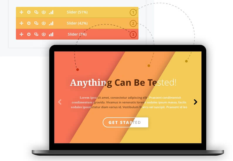
Anything Can Be Tested
The beauty of Divi Leads is that it is built right into the Divi Builder, which means anything can be tested.
You can test changes to individual modules, such as adjusting buttons colours or heading text, or you can test entirely different sections of content.
You can start big and narrow your focus with each test, systematically improving your page and reaping the rewards.
When you start a test, Divi Leads will duplicate your test subject (whether that test subject is a module, row or section). You can then make changes to each variation independently.
Once your two variations are ready, Divi Leads will display each version to different visitors and track the results.
Intelligent Goal Selection
When you create a new split test, you give Divi Leads a goal. Any module, row or section on your page can be a goal and depending on the goal you select, Divi Leads will track unique statistics that can be used to determine the conversion rate of that goal.
For instance, if you select the Shop Module as your goal, Divi Leads will track sales statistics to determine how changes to your page increase or decrease sales.
Since Divi Leads is built right into the builder, you can get very specific with your goal and Divi Leads will take care of the rest.
Backed by Powerful Insights
Once you start a split test, Divi Leads will begin tracking the results and the results will be presented in a series of graphs and charts that show you exactly how well each version of your subject is performing.
After enough data has been collected, it will become clear which test variation is the best and you can then select your highest performing variation as the winner.
The Advanced Divi Leads Split Testing System Is Now Available For The Visual Builder: Today we are excited to bring the most advanced WordPress split testing system to the Visual Builder.
Put the Divi Visual Builder’s awesome new features to use on your next project
Working with the Divi Visual Builder is the ultimate way to produce and edit your pages.
It allows you to work on the actual page and to see your additions and edits almost instantly… as if by magic!
And the latest improvements and updates have made the Visual Builder even better: updating to React 16 has made the Builder lightning fast, improvements to the Builder interface have made it much easier and enjoyable to work with and the addition of Divi Leads split testing means that you can now actually prove how well your content is converting.
Why not use Divi on your next project?
If you’d like to use the Divi Visual Builder’s awesome new features on your next project, then please feel free to use my Divi theme 10% discount link below.
437,821 Customers Are Already Building Amazing Websites with Divi. Join the Most Empowered WordPress Community on the Web.
We offer a 30-Day Money Back Guarantee, so joining is Risk-Free!
Elegant Themes
Join Elegant Themes and download the Divi theme today.
Complete with a 10% discount!
Credits:
My thanks and gratitude to Elegant Themes for the graphics and video of the Divi Visual Builder Improvements and Updates, used in this post.


