If I asked you to name your favourite part of the Divi Builder, you’d probably say Modules or Sections. I’m pretty sure that you wouldn’t say Rows, because Rows are dull, boring, they just aren’t sexy… until now that is.
In Divi 2.4 Rows have been given a serious makeover. You can now define Fullwidth Rows and Custom Row Widths and you can define Column Background Colour, Column Background Image, Column Padding plus a whole lot of Advanced Design Settings including Equalize Column Heights.
This is the seventh in a series of posts designed to help you become familiar with the new features of Divi 2.4, to give you ideas on how and where to use them in practical web design situations and to provide you with resources to help build your Divi Library.
Be sure to check out the other posts in this series:
All you need to know about Global Library Items
Advanced Design Settings and a FREE Library Pack
Create gorgeous Blog Posts with the Divi Builder
Get creative with Divi ‘s new Footer Layouts
The Code Modules for shortcode and HTML integration
New Header and Navigation styles and formats
My Affiliate Links Disclosure
Hi everyone. Just to let you know that many of the links on this site are my affiliate links. What that means is that if you click one of them and buy something… I get a commission. It doesn’t cost you anything extra and I only recommend things that I’ve tried and tested, so please, please, please… use my links.
Row and Row Settings… a new era in the creation of Divi layouts
The building blocks of the Divi Builder are: Sections, Rows and Modules.
Sections are the largest organizational element and are used to separate blocks of content on the page. Inside each Section you place Rows of Columns, and inside each Column you can add as many Modules as you like.
Modules provide the functionality (contact forms, blurbs, images, sliders, portfolios…) but Rows control how that content is arranged and Divi 2.4 includes lots of new Row options. The new options allow you to create some super cool effects and they also expand the range of layouts that can be created.
This video, from the Divi theme documentation, is a great introduction to the new Row options and it also gives a few pointers on how they can be used in practice.
The video is a great introduction, but the best way to become familiar with the new settings is to try them yourself on a development site… just in case.
The new Row Options are accessed by clicking the settings icon at the top left of any Row on your page.
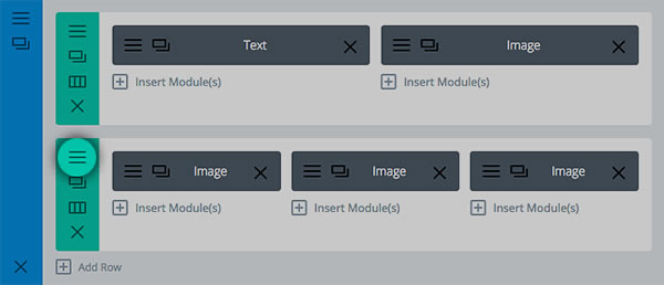
For ease of access the Row Module Settings are grouped under three tabs: General Settings, Advanced Design Settings and Custom CSS and we’ll take a look at each in turn.
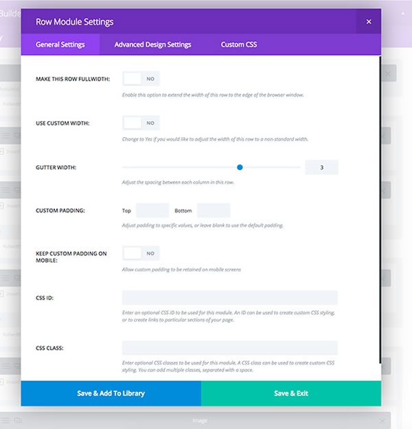
Row Module Settings – General Settings
This is where you’ll find all the general layout settings that affect the overall row structure.
These settings are the ones that you’ll use a lot and they are all pretty easy to understood.
- Fullwidth Rows – make any Row fullwidth and add any Module to that fullwidth Row.
- Adjustable Gutter Width – adjusts the spacing between each Column in your Row. This spacing can either be increased or decreased, and it can be decreased to zero, which makes Modules touch edge-to-edge.
- Custom Row Widths – define custom widths for your Rows. This is a great way to add variety to your page and interest to your content.
- Custom Padding – define custom padding above and below your rows. This spacing can be adjusted to fit your content and define separation.
- Mobile Padding Adjustment – by default, custom Row padding is not applied to mobile devices because large padding values don’t always look good on a smartphone. This setting allows you to apply these padding values if you want to.
- CSS ID and CSS Class – assign custom CSS IDs and Classes to Rows, which can then be targeted using anchor links or styled using custom CSS.
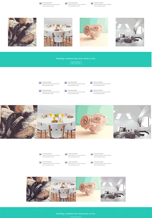
The screenshot below shows examples of Fullwidth Rows, Adjustable Gutter Widths and Custom Row Widths.
As you can see, with just a few changes you can produce some simple but eye catching effects.
Row Module Settings – Advanced Design Settings
Inside the Advanced Design Settings you’ll find lots of new options that allow you to adjust every aspect of your Row’s appearance.
If you want extra control over your Row’s design, then this is the tab for you.
- Background Image – add background images to your Rows. The image will be placed behind any Modules, which are in the Rows.
- Background Color – apply background colors to Rows.
- Background Video – add video backgrounds to individual Rows within a Section.
- Parallax Mode – apply a parallax effect to a background image. Parallax mode creates an illusion of depth by moving the background image at a slower speed than the speed at which you are scrolling.
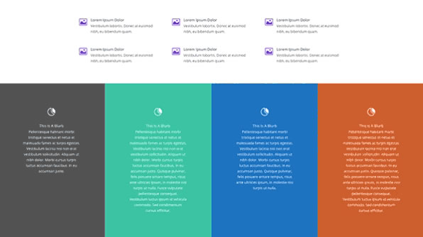
- Equalize Column Heights – equalise Column heights, even if they have different amounts of content. Each Column takes on the height of the tallest Column in the Row. This is a great feature when you have applied a background colour to each of your Columns as in the screenshot below.
And some super duper new Column Settings
Depending on the type of Row you add, and how many Columns the Row contains, you’ll find a range of new Column settings under the Advanced Design Settings tab.
The settings allow you to adjust the styling for each individual Column within the Row.
- Column Background Image – add a background image to each Column.
- Column Padding – adjust the padding for Columns allowing you to give the content within each Column more room to breathe.
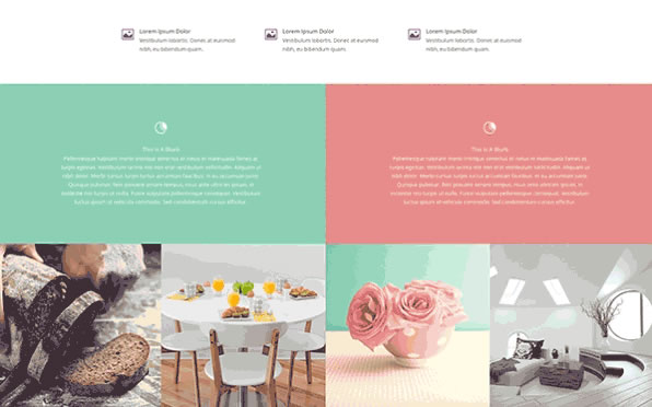
- Column Background Color – give individual Columns within each Row their own background colour.
The screenshot below shows how effective this option is and what a great looking effect it produces.
Row Module Settings – Custom CSS
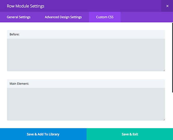
And just in case the Elegant Themes team have missed anything… this is where you can add your own custom CSS and do absolutely anything that is not already possible using the Row Module Settings.
Note: Any Custom CSS that you use within a Row won’t be lost when you update your theme, which makes it a great alternative to using a Child Theme.
Mix and match the Row options to produce some fabulous effects
At this point you’re probably wondering what you can do with all these options and how you can use them to produce creative layouts for your own sites.
The best way to become familiar with the new options is to experiment with them on a development site and to get you started here are five examples that will show you the possibilities and point you in the right direction:
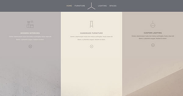
Example #1 – Here 3 Blurbs have been placed inside of a 3 Column Row and “Make Fullwidth” has been enabled to extend the Row the full width of the browser.
The spacing between each Column has been removed by setting the “gutter spacing” to the lowest setting and a custom background colour has been added to each Column and matched to the fullwidth image below it.
“Equalize column heights” has also been enabled to ensure that each of the Columns and their custom background colours merge perfectly.
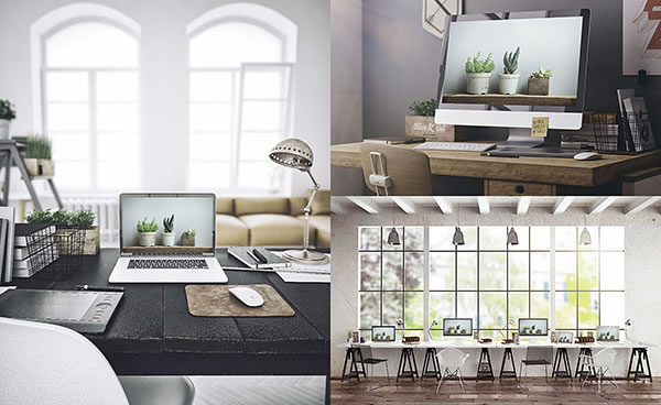
Example #2 – You can also create a fullwidth image gallery with Rows. Here three image Modules have been placed into two different Rows with “fullwidth” enabled.
The padding from each Row has been removed by setting “padding” to “0.” and the spacing between each Column has been removed by lowering the Row’s gutter spacing to the lowest value.
The result is that the edge of each image touches and the width of the Row extends the full width of the screen.
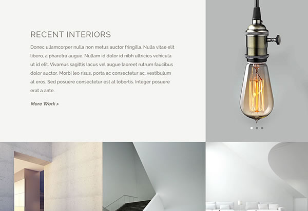
Example #3 – The gallery grid effect can also be combined with Text and Image Sliders. This example uses a combination of Image Modules, Image Gallery Modules and Text Modules to create a gutter-less fullwidth media display.
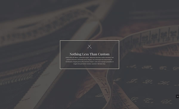
Example #4 – This example uses the Row’s padding options to increase the padding on the top and bottom of the Row.
This creates lots of space above and below the Blurb Module, which has been centred inside of a single Column.
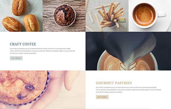
Example #5 – Column background images can be used to create visually stunning effects and in this example an empty Column has been used with a custom background image.
When made fullwidth and paired with a CTA Module on either side, you can produce a great looking checkerboard effect.
Create your own stunning layouts with Divi 2.4’s new Row options
With the release of Divi 2.4 you can now define Fullwidth Rows, Custom Row Widths, Column Background Colour, Column Background Image, Column Padding plus a whole lot of Advanced Design Settings including Equalize Column Heights.
And what’s more important to you and your websites is that if you mix and match these features, add a touch of imagination and a sprinkling of creativity, you can create page layouts that will surprise, delight and captivate both you and your visitors.
If you’d like to start using Divi 2.4 to create your own Row centred layouts, then sign up with Elegant Themes, download your copy of Divi and start creating layouts that you never thought possible.
Wow, I am sure you do not mind hearing this as much as possible but thank you for the amazing job that your team has done Nick. From the updates and support all the way to the blog and documentation. I very well may never use another WordPress theme. I don’t see the need for it.
David – Elegant Themes blog
I hope that you enjoyed the post and that it’s given you a few ideas for using Divi 2.4’s Row and Column options.
if you have any thoughts about Divi’s new features in general or the Row options in particular, then please leave a comment and if you’d like to spread the word about this fabulous Drag and Drop theme, please use my social sharing icons below.
Credits:
My thanks and gratitude to Elegant Themes for the graphics and details of Divi’s new Row options used in this post.
