The most important part of any website is… the header.
And that’s because the header is the first thing your visitors see, it’s their first impression.
Fortunately if you’re a Divi theme user you can now use Divi 2.4’s Header and Navigation Customizer to create some absolutely stunning header and navigation combinations.
You can give your fixed navigation a custom design, hide/show your logo on scroll, centre your logo in line with your menu links, add transparency and animation effects and a whole lot more.
This is the sixth in a series of posts designed to help you become familiar with the new features of Divi 2.4, to give you ideas on how and where to use them in practical web design situations and to provide you with resources to help build your Divi Library.
Be sure to check out the other posts in this series:
All you need to know about Global Library Items
Advanced Design Settings and a FREE Library Pack
Create gorgeous Blog Posts with the Divi Builder
Get creative with Divi ‘s new Footer Layouts
The Code Modules for shortcode and HTML integration
My Affiliate Links Disclosure
Hi everyone. Just to let you know that many of the links on this site are my affiliate links. What that means is that if you click one of them and buy something… I get a commission. It doesn’t cost you anything extra and I only recommend things that I’ve tried and tested, so please, please, please… use my links.
The Header and Navigation Customizer with new styles and formats
The Customizer in Divi 2.4 provides you with much more control than you had previously. You can now give your fixed navigation a custom design, hide/show your logo on scroll, centre your logo in line with your menu links, add transparency and animation effects and lots of other cool settings.
This video by Nick Roach runs you through the Header and Navigation settings in the new Customizer and points out some of the options available.
The 2.4 Header and Navigation section in the Customizer now has separate sections for: Header Style, Primary Menu Bar, Secondary Menu Bar, Fixed Navigation Settings and Header Elements, which includes your phone number and social icons.

Two powerful new settings under the Header Format tab
Two settings that are new to the “Header Format” tab are the Centered Inline Logo header style and the Hide Navigation Until Scroll setting.
Both of these options allow you to change the look and feel of your header with just a few mouse clicks.
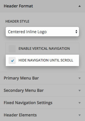
#1 – Centered and Centered Inline Logo
You may want to centre your logo because you have a symmetrical logo, only have a few menu links or you have centered page content and you want your header to be consistent.
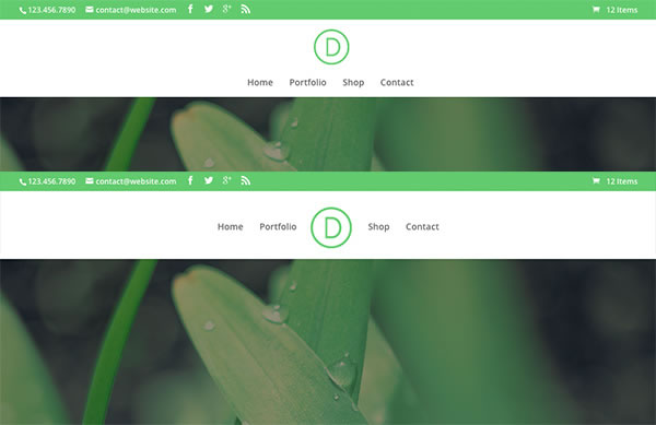
Centering your logo places it above your menu links, but you can also have a centered inline logo, which places it in line with your menu links and reduces the height of your navigation.
The centered inline logo looks best when you have an even number of menu links and the length of your menu item labels produces an approximately symmetrical layout.
#2 – Hide your Navigation until after the user scrolls
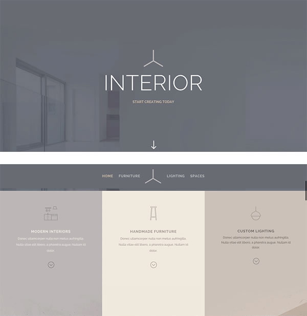
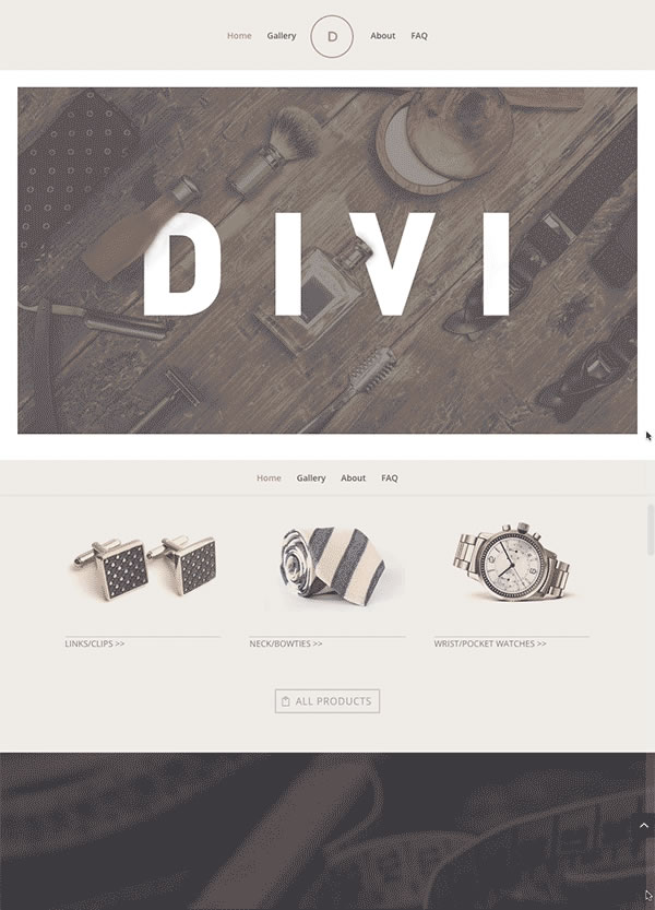
If you’re using a fullscreen header, or a header that already contains your logo and/or a call-to-action, you may not want your logo and navigation links to interfere with the first section on your page. In that case you can turn on the “Hide Navigation Until Scroll” setting and your navigation will only appear once you visitors start to scroll.
And don’t worry if you don’t want this effect on all pages because you can turn it on and off on a page by page basis.
The graphic below shows the page as seen initially and as the visitor begins to scroll and the navigation appears.
Primary Menu Bar controls and settings
Divi 2.4’s Primary Menu Bar controls now include settings such as: “Make Full Width”, “Menu/Logo Height”, and “Font Style” which allow you to customise your Primary Menu to your heart’s content.

The settings are pretty intuitive, but just to get you up and running here’s a quick overview of what each one does:
- Let your Menu span the full width of the browser
The new “Make Full Width” option lets your header content take on the width of the browser instead of being contained by your main content width.
- Hide your logo (before scrolling) in your Primary Navigation
This option is useful when you have enabled Fixed Navigation so that your logo appears after the user scrolls. Hiding your logo before scrolling is useful if you’re already displaying it in the first section on your homepage.
- Adjust your menu/logo height
Increase or decrease your menu/logo height with a simple range slider.
- Primary navigation typography controls
Control the font, size, colour, style, and letter spacing of your menu links from inside the customizer.
- Header and dropdown menu text and background colour settings
Choose your text and background colours and set the transparency of those colours.
Note: If you choose a transparent background colour for your header background, the first section of your website will appear underneath your header and extra top padding will automatically be added so that your navigation won’t overlap its contents. - Animate your dropdown menus
Choose from four intro animations for your menu links dropdown menus: Fade, Expand, Slide, and Flip.
Secondary Menu Bar controls and settings
The design settings that you have for your Primary Menu Bar are also available for your Secondary Menu Bar.
The Secondary Menu Bar will only display if you have defined a phone number, email address, social network links, and or you have assigned a secondary navigation menu.
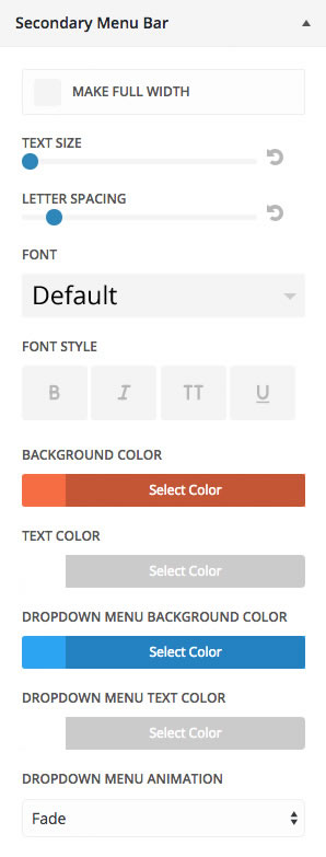
Here are a few examples of secondary navigations that use different combinations of colours, fonts, and type styles.

Fixed Navigation Settings
By default in Divi, when a user scrolls down the page, the navigation bar sticks to the top of the browser, the logo shrinks, and the header decreases in height.
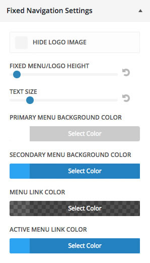
The header that you see after scrolling is your Fixed Navigation Bar, and in Divi 2.4 you have full control over what it looks like. The colours and size settings you set in the customizer will smoothly transition from their Primary Menu settings to the Fixed Navigation Settings when you scroll.
For example, if your “Active Menu Link Colour” was green in your primary nav, and blue in your fixed nav, as seen in the settings below, it would fade from green to blue as soon as the user starts scrolling.
Hide your logo after scrolling
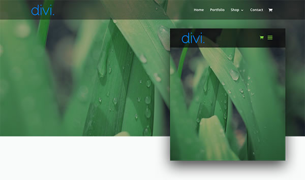
One of the settings for the Fixed Navigation is “Hide Logo Image”. This allows you to hide your logo in your Fixed Navigation so that it disappears when a user scrolls.
This means that the fixed navigation will take up less screen space while users browse your site, as shown in the example below:
Specify Navigation Styles for Mobile Devices
Divi 2.4’s Theme Customizer also has a new Mobile Styles menu that allows you to define a few mobile settings for you navigation.
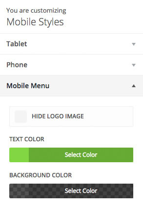
In the example below the header background has been darkened and the menu links changed to green on mobile.
Header and Navigation combos to get your creative juices flowing
By now your head must be spinning at the thought of the number of possible header and navigation combinations available and you must be wondering how you will make a choice.
Don’t worry, here are a few stunningly good looking examples that will help you choose the combination that gives you a unique combo and is absolutely right for you.

Create your own stunning Header / Navigation combinations with Divi 2.4
As I said at the beginning: “The most important part of any website is… the header. And that’s because the header is the first thing your visitors see, it’s their first impression.”
With Divi 2.4’s Header and Navigation Customizer settings you can now create stunning Header / Navigation combinations with just a few mouse clicks and without touching a single line of code.
If you’d like to start using Divi 2.4 to create your own header and navigation combos, then sign up with Elegant Themes, download your copy of Divi and start creating headers that will grab your visitors’ attention and create that great first impression.
These are all amazing additions but my personal favourite has to be the animated dropdown styles. I don’t think I have seen those on any other theme thus far.
Adam Binder – Elegant Themes blog
I hope that you enjoyed the post and that it’s given you a few ideas for using Divi 2.4’s Header and Navigation options.
if you have any thoughts about Divi’s new features in general or the Header and Navigation Customizer in particular, then please leave a comment and if you’d like to spread the word about this fabulous Drag and Drop theme, please use my social sharing icons below.
Credits:
My thanks and gratitude to Elegant Themes for the graphics and details of Divi’s new Header and Navigation styles and formats used in this post.
