When the Divi theme was first released, it was like a breath of fresh air blowing through the WordPress community. It allowed every WordPress user to stop coding and start creating.
Divi’s secret was the Divi Page Builder with its simple drag and drop interface, which allowed you to create just about any combination of page layout and functionality that you could think of.
Unfortunately the Divi Page Builder was well named, because it couldn’t be used on posts… until now that is!
With the release of Divi 2.4 you can now use the Divi Builder to build gorgeous eye catching blog posts complete with their own unique styling for title, meta and featured image.
This is the third in a series of posts designed to help you become familiar with the new features of Divi 2.4, give you ideas on how and where to use them in practical web design situations and provide you with resources to help build your Divi Library.
Be sure to check out the other posts in this series:
All you need to know about Global Library Items
Advanced Design Settings and a FREE Library Pack
My Affiliate Links Disclosure
Hi everyone. Just to let you know that many of the links on this site are my affiliate links. What that means is that if you click one of them and buy something… I get a commission. It doesn’t cost you anything extra and I only recommend things that I’ve tried and tested, so please, please, please… use my links.
Yes you heard me… you can now use the Divi Builder on Posts
Divi 2.4’s new fluid grid allows layouts built with the Divi Builder to be used anywhere and still retain their design integrity. That means that the Builder can now be used on posts.
Creating a post using the Divi Builder is pretty much the same as creating a page:
- From your WordPress dashboard go to Posts > Add New and the new post window will open.
- Click the “Use The Divi Builder” purple button on the upper left of the post window and the Divi Builder pane will appear with a single Standard Section containing a single Row.
- Add Sections, Rows, Columns and Modules, as you would with a page, to create your post.
When you use the Divi Builder on posts you can still choose between Left Sidebar, Right Sidebar, or Full Width post layouts. You can also use the new Post Title Module to control your Post Title, Meta Data and Featured Image on a post by post basis – see below for more info.
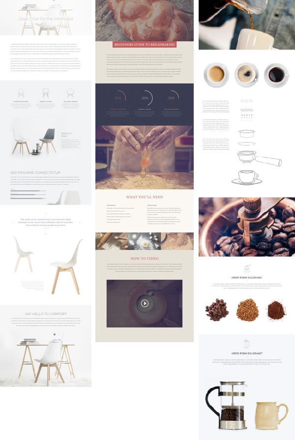
Here are three examples of posts created using the Divi Builder… hope they give you a feel for what can be achieved and get your creative juices flowing for your own posts.
Use Divi’s Post Title Module to give each of your posts a unique look
Along with the ability to use the Divi Builder on posts, Divi 2.4 also introduced the Post Title Module, which allows you to customise the display of standard post elements such as: Post Title, Meta Data and Featured Image.
This Elegant Themes video runs you through all you need to know about this powerful new module:
The Post Title Module automatically displays all the things you would normally find at the top of your post such as post title, author name, post date, comment count, categories and featured image.
These pieces of information can be toggled on and off, and can also be re-arranged into different layouts and styles to produce great looking effects.
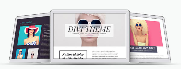
Combining the Post Title Module’s options for text placement, featured image placement, and text orientation gives you nine different layouts that you can use to display your title, meta, and/or featured image as shown below:
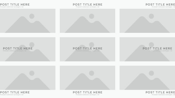
This allows you to create a unique look for each of your blog posts.
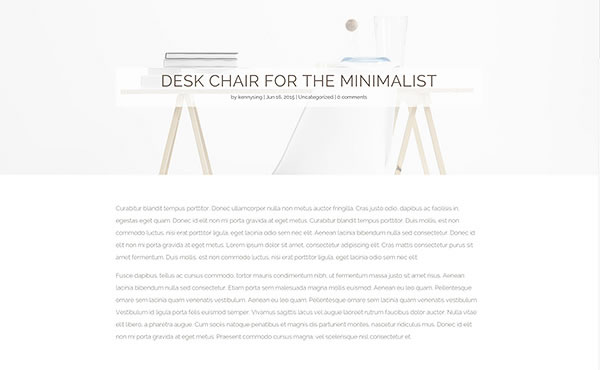
In the example below, the standard post title display has been disabled and the Divi Post Title Module added. The Module has been configured to display the Featured Image as a background, custom text styling for the title has been added along with a semi-transparent background.
How to set up the Divi Post Title Module
Setting up the Divi Post Title Module is easy peasy it’s just a simple two step process:
#1 – Disable the standard post title display
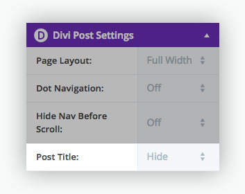
Once you activate the Divi Builder for your post, the Divi Post Settings at the upper right of the post screen will display an additional item called Post Title.
Set the Post Title to Hide, as shown below, and the standard post title display will be disabled.
#2 – Add the Divi Post Title Module to the top of your post and customise
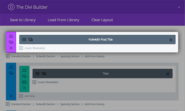
Having disabled the standard Post Title, add the Divi Post Title Module to the top of your post and configure the settings.
Tips for creating blog posts with the Divi Builder
This is where it gets difficult because we all have our own ideas about what a blog post should contain and how it should be presented.
That means that these tips are my thoughts on blog posts and as you can see I keep my posts simple, use graphics, lists, boxes and am a great fan of whitespace.
Your do’s and don’ts for creating blog posts may be completely different to mine, but to get the ball rolling, here we go:
- Go easy on the bells and whistles – there are a lot of Modules available in Divi but initially limit yourself to the Text and Image Modules. You can add a few extras once the post has taken shape but generally… keep it simple.
- Use high quality images – don’t spoil your posts by using low quality graphics. Only use high quality imagery… even if you have to pay for it.
- Do you really need to go fullwidth – before you go fullwidth, make sure that you take a look at the overall composition of your post. Sometimes a sidebar can be used to add useful links, subscribe buttons etc. and give the page a more familiar feel.
- White Space is an essential part of any post – make sure that your content, text and images, has room to breathe. Use Divi’s custom spacing controls in the Advanced Design Settings tab.
- Text and images should work together – in any blog post the text and images should work together and complement each other. Make sure that each image has a purpose, even if only to break up the text and add interest, and adds to the post.
- Add backgrounds to your Sections to separate content – Sections are a great way to separate larger chunks of content. By adding backgrounds to your Sections you make that separation even more obvious.
- Use columns to break text into chunks – large areas of text can be daunting so do what the newspapers do, use columns to break text into more visually pleasing, less daunting and easily manageable chunks.
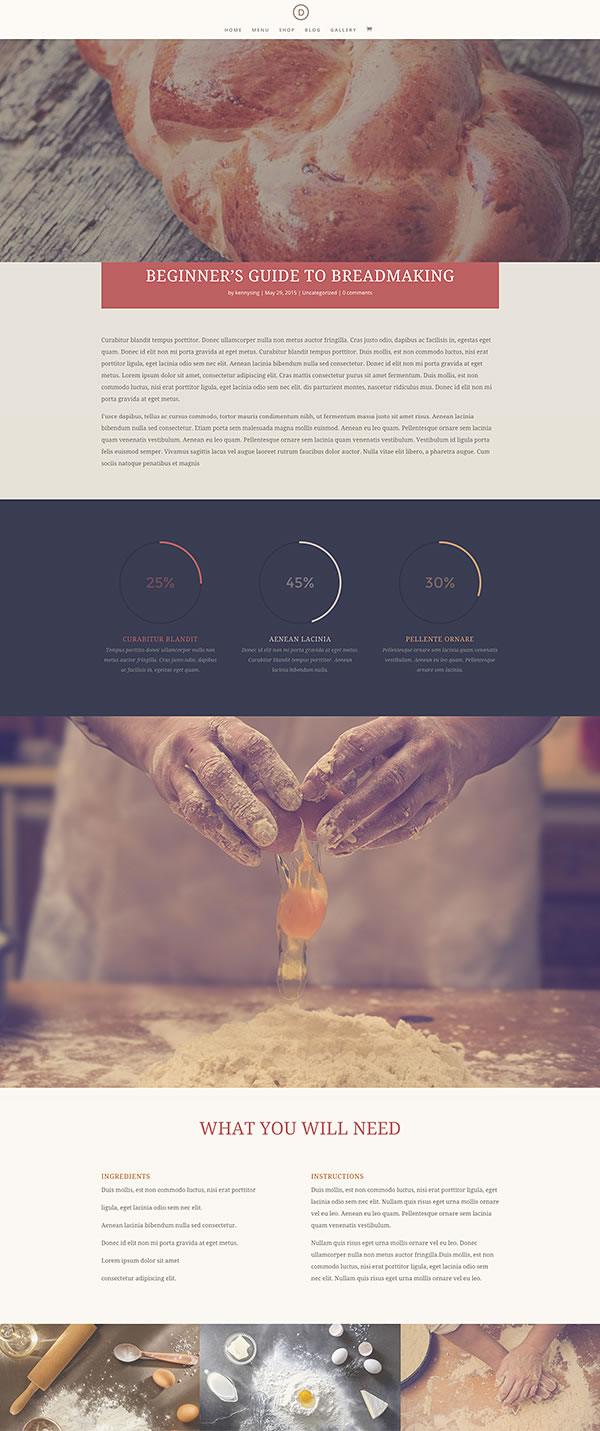
This example is a great looking Divi Builder blog post, which uses many of the tips above:
It uses a limited number of Divi Modules, backgrounds have been added to Sections, content is floating in a sea of whitespace, images match the content perfectly and columns have been used to break up blocks of text.
Pick up your copy of Divi 2.4 and start creating those gorgeous posts
The ability to use the Divi Builder on posts means that Divi is no longer a page based theme but is now a comprehensive theme that can be used to create both beautiful pages and posts.
Combine this feature with the Divi Post Title Module and you have the ability to create feature rich posts, each of which is unique – your blog posts will never be boring again!
If you’d like to join the Divi community and start creating your own unique blog posts using the Divi Builder and its Modules, then sign up with Elegant Themes, download your copy of Divi and start creating those fabulous drag and drop posts.
Plain and simple, you guys just rock – completely raising the standards on what should be expected from theme developers. Hands down best customer support every time – not just good at coding but great at business and listening to what is needed. You guys care about your customers and that is invaluable! Thanks and much love!
Jenn Eze – Elegant Themes blog comment
I hope that you enjoyed the post and that it gave you an insight into using Divi 2.4’s Divi Builder on posts to create truly unique posts.
if you have any thoughts about Divi 2.4’s new features in general or using the Builder on posts in particular, then please leave a comment and if you’d like to spread the word about this fabulous Drag and Drop theme, please use my social sharing icons below.
Credits:
My thanks and gratitude to Elegant Themes for the graphics and details of Divi 2.4’s Divi Builder on posts feature used in this post.
