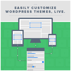
I keep telling everyone that they’ll love the Divi 3.0 Visual Builder, but what if I’m wrong and when you try it, you decide that front-end editing isn’t for you?
Fortunately Elegant Themes have come up with a solution.
They’ve set up a free Divi 3.0 demo site where you can play with the Visual Builder to your heart’s content, without wreaking havoc on your own site.
It’s a great idea but playing with a demo site can be a tad uninspiring because you’re only playing, you’re not doing it for real and you lack direction.
So in this post I’ll introduce you to the demo site, run through the basic building blocks (Sections, Rows and Modules) used to create a page using the Divi Builder and to give you a little direction, I’ll set you three tasks to complete on the demo site.
And don’t worry, you can’t do any damage so let rip, have a good time and see what front-end editing is all about!
My Affiliate Links Disclosure
Hi everyone. Just to let you know that many of the links on this site are my affiliate links. What that means is that if you click one of them and buy something… I get a commission. It doesn’t cost you anything extra and I only recommend things that I’ve tried and tested, so please, please, please… use my links.
An introduction to the Divi 3.0 Visual Builder demo site and the basic building blocks of Divi
The Visual Builder demo site is a fully functional site where you can try out all the Builder’s features.
The only thing that you can’t do is save your changes.
To get started, hit the big green button below and you’ll be taken to the Visual Builder demo site.
Now that you’re on the demo site, move your cursor over the page and you’ll notice that blue and green rectangular areas appear with matching blue and green toolbars in the upper left corner.
You’ll also notice that inside the green rectangles, one or more grey toolbars appear.
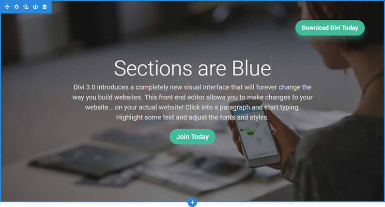
The blue rectangular areas are Sections, the green rectangular areas are Rows and the grey toolbars are the controls for Modules.
Sections, Rows and Modules are the basic building blocks of Divi and the colour coding makes it really easy to learn how to build pages using the Visual Builder.
Blue Sections
Sections are outlined in blue with a blue toolbar in the upper left and a white + sign in a blue circle in the centre of the bottom border.
They are the basic and largest building blocks used in Divi layouts and they are used to contain large groups of content.
They are the first elements you add to your page.
Green Rows
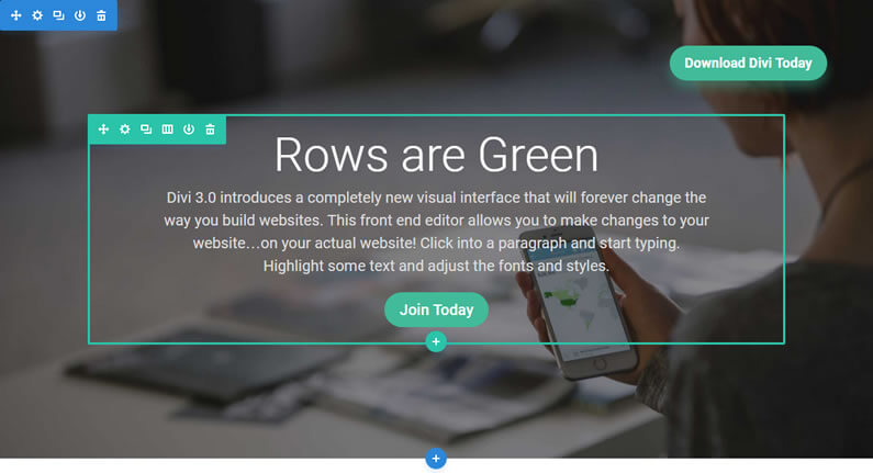
Rows are outlined in green with a green toolbar in the upper left and a white + sign in a green circle in the centre of the bottom border.
They sit inside Sections and you can place any number of Rows inside a Section.
Rows are the second elements you add to your page.
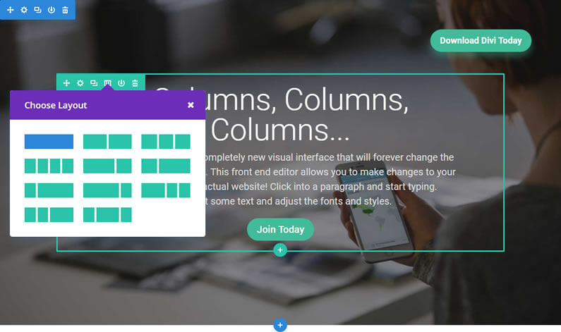
Rows contain Columns and when you create a Row you will be prompted to specify the Column layout for that Row.
All you have to do is click on the Column layout that you want and it will be added to the Row.
And don’t worry if you change your mind, the column layout can be changed with just a few mouse clicks.
Grey Modules
Modules don’t have an outline colour but they do have a grey toolbar and a white + sign in a grey circle beneath the toolbar.
They are the content elements of your page and include basic Modules such as Text, Images and Buttons, or more advanced Modules like Sliders, Portfolio Galleries and eCommerce Shops.
Every Divi Module can fit into any Column width and they are all fully responsive.
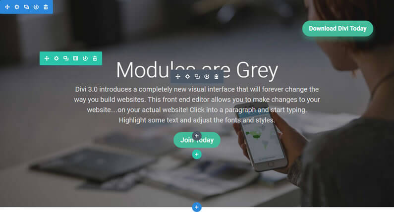
Summary: You build your pages and posts using the three basic building blocks: Sections, Rows and Modules.
First you add Sections, then Rows (with your chosen Column layout) and then Modules… blue Sections, green Rows and grey Modules.
Check out Nick Roach’s Visual Builder video
Before you jump into the exercises, take a look at this excellent video from Nick Roach, which gives you a great introduction to the Visual Builder.
Divi Visual Builder exercise #1
In the first exercise you’ll add your own text, change the Column structure of a Row, duplicate a Module and drag it into an empty Column.
All the action for this first exercise takes place in the top Section, which has 1 Row with 1 Column and the Column contains a Call-to-Action Module.
So if you’re sitting comfortably, we’ll begin.
1 – Add your own text
- Click into the text “Build Things Visually” and type your own text… I’ve typed “Hello my Name is Keith”.
2 – Change the Row’s Column structure
- Hover over the Column’s green toolbar and click the 4th icon, which has a tool tip saying “Change Column Structure”.
- From the Column popup, which appears, pick two Columns.
- The Row now has two Columns and the empty Column contains a + icon in a grey circle, which has a tool tip saying “Add New Module”.
3 – Duplicate the Call-to-Action Module
- Hover over the Call-to-Action Module until its grey toolbar appears.
- Click the 3rd icon, which has a tooltip saying “Duplicate Module” and a duplicate of the Module will appear beneath the original.
4 – Drag the duplicated Module into the empty Column
- Hover over the duplicated lower Module until its grey toolbar appears.
- Left click on the first icon, which has a tooltip saying “Move Module” and drag the Module into the empty Column.
Fantastic, you’ve completed exercise #1 and your completed effort should look something like the example below:
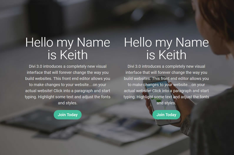
Typing on the page to add / change text, changing Column structure, duplicating and dragging and dropping content are the basic operations of building pages with the Divi Visual Builder.
As you can see building pages on the actual pages is quick, intuitive and immensely satisfying.
Divi Visual Builder exercise #2
In the second exercise you’ll become acquainted with the Settings panel and use it to change the colour of the Call-to-Action button.
To get started scroll down the demo page to the third Section, which contains a single Row with two Columns of proportions 1/3 : 2/3.
The left Column contains an Image Module and the right Column contains a Call-to-Action Module.
So on that note, let’s get started.
1 – Bring up the Call-to-Action Settings panel
- Hover over the Call-to-Action Module until its grey toolbar appears.
- Click on the second icon, which looks like a gear and has a tool tip saying “Module Settings” and the Call-to-Action Settings panel will appear.
2 – Change the colour of the Call-to-Action button
- Click on the Design tab of the Call-to-Action Settings pane – the second tab.
- Scroll down the settings until you find “Button Background Colour”.
- Click “Select Colour” and a colour picker will appear.
- Pick your button colour using the colour picker or type in the HEX value….. I’ve used a rather nice turquoise.
- Click the tick at the bottom of the settings panel to close the panel and save your changes.
That’s exercise #2 done folks and if all went well you should have a bright shiny button with a gorgeous eye catching colour like my example below:
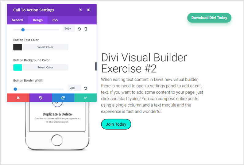
All of the Divi building blocks, Sections, Rows and all of the individual Modules have settings panels.
Each of them contains three tabs, General, Design and CSS.
You’ll find almost everything you’ll ever need under the General settings, more detailed styling controls can be found under the Design Settings and for adding those final flourishes and touches you can use the CSS tab.
Divi Visual Builder exercise #3
In the first exercise you duplicated a Module and in this exercise you’ll duplicate a whole Section.
We’ll then change the background image, add a new Row with two Columns and add content to the Columns.
The starting point for this one is in the first section so let’s get to it.
1 – Duplicate the first Section
- Hover over the top Section until its blue toolbar appears.
- Click the third icon, which has the tool tip “Duplicate Section” and an exact copy of the Section, including all its contents, will appear beneath the original Section.
2 – Change the background image of the duplicate Section
- Hover over the duplicate Section until its blue toolbar appears.
- Click the second icon, which looks like a gear, and the Sections Settings panel will appear.
- Under the General tab the first item is “Background Image” and the field already has a URL to the image. Click the Upload button to the right of the URL field and you will be taken to the available images in the WordPress library.
- Click the dark grid layout image at the bottom and then click the blue “Upload an Image” button at the bottom right. Your image will now appear as the background image of the new Section.
- To close the Settings panel, click the tick at the bottom.
3 – Add a new Row with two Columns
- Within the duplicate Section hover over the Row until its green outline appears.
- Click the white + sign in a green circle in the centre of the bottom border, which has the tool tip “Add New Row”, and you will be prompted to specify how many Columns the new Row has – pick two equal width Columns.
- When you create the new Row you will be prompted to add a Module – ignore this by clicking the cross at the top right of the “Insert Module” prompt box.
4 – Drag content into the left Column
- To populate the left Column, duplicate and drag a Call-to-Action Module into the Column.
I duplicated the “The Future Of WYSIWYG” Call-to-Action Module from lower down the page and dragged it into the column. I also removed some of the text and reduced the size of the heading text via the Module Settings panel.
5 – Add a Contact Form Module to the right Column
- Click the white + sign in a grey circle in the middle of the right hand Column and the “Insert Module” panel will appear.
- Scroll down the list of available Modules and click on Contact Form, which will bring up the Contact Form Settings panel.
Close the panel by clicking the tick at the bottom – you can go back later and customise the Contact Form.
I removed the Captcha and changed the default colour of the form field text so that it would be more easily seen.
If you got this far then you deserve my congratulations and if all went well you should have something that looks vaguely like my effort below:

With the ability to duplicate whole Sections and then change and add content, you can see how quickly pages can be created.
Complex functionality such as Sliders, Contact Forms, Portfolio Galleries and eCommerce Shops can also be added using Divi’s Content Modules, which means that you don’t have to add lots of third party plugins.
Try the Visual Builder demo site – it will change forever, the way you build websites
Hopefully these three short exercises have shown you how easy it is to build a web page, when you can see what you are actually doing, when you are working on the actual page and getting instant feedback.
The Divi Visual builder makes the whole design process quicker, easier and much more intuitive and most importantly… it puts the fun and excitement back into web design.
The Future of WYSIWYG: When you make a change in the new visual builder, your page is updated instantly. Text on the page feels tangible as you slide the font size controls and watch your words expand and contract with each gesture.
The page feels alive as you explore the color picker and watch each glowing transformation.
If you’d like to swap “content creation” in the back-end of WordPress for “creative designing” on the actual pages of your website, then sign up with Elegant Themes and start using the Divi 3.0 Visual Builder today.
Take the Visual Builder for a free test drive
If you’ve not followed along with the exercises, you can still take the Visual Builder for a free test drive by hitting the big green button below!

Create your WordPress masterpiece with Divi 3.0’s Visual Page Builder
I hope that you enjoyed the post and that you are as excited about Divi 3.0’s front-end editing as I am.
If you have any thoughts about the Divi theme in general or the Divi 3.0 Visual Builder demo site in particular, then please leave a comment and if you’d like to spread the word about this fabulous On-Page theme, please use my social sharing icons below.
Credits:
My thanks and gratitude to Elegant Themes for the video and graphics used in this post and of course, for providing such a fabulous demo site .

