Your header has to do a lot: it has to make it obvious what the site is about, it has to make it easy to navigate to other parts of the site and most importantly… it has to grab and hold the attention of your visitors.
Divi already allows you to customise the layout of your Header and Navigation via its Header and Navigation options and Divi 2.6 has added two new Header styles, which the Divi community have asked for.
The new Header styles are: the slide-in Header and the fullscreen Header and both are great additions to Divi’s already comprehensive Header controls.
In this post I’ll remind you of the Divi Customiser’s Header and Navigation options, point out the five Header styles and then look at the two new Header styles.
My Affiliate Links Disclosure
Hi everyone. Just to let you know that many of the links on this site are my affiliate links. What that means is that if you click one of them and buy something… I get a commission. It doesn’t cost you anything extra and I only recommend things that I’ve tried and tested, so please, please, please… use my links.
A reminder of the Divi Customiser’s Header and Navigation options
Divi’s Header and Navigation options are found in the Theme Customiser, which is accessed from your WordPress Dashboard via Appearance > Customise.
The Theme Customiser allows you to customise your theme without touching a line of that nasty code and this video by Elegant Themes guides you through the options and settings.
This video is part of the fabulous text and video documentation that makes learning Divi a breeze.
Divi now comes with five Header styles
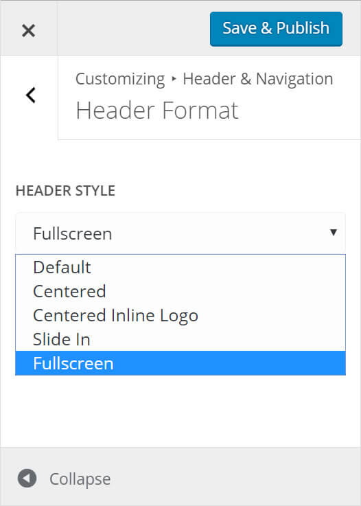
Divi now has five Header styles: Default, Centred, Centred Inline Logo and the two new ones: Slide In and Fullscreen.
The Header styles are accessed from your WordPress dashboard via Divi > Theme Customiser > Header & Navigation > Header Format > Header Style.
From there you can play around with the options and check out, via the preview, what the results look like. And don’t worry nothing is permanent until you hit the big blue “Save & Publish” button.
New Header style #1 – Slide In Header
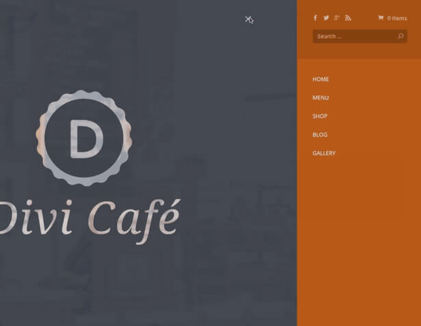
The first of the new Header styles is the Slide In Header.
When you choose this option, both your primary and secondary Navigation links are consolidated and hidden within a classic Hamburger menu, which means that when your visitors arrive they are presented with a gloriously uncluttered page.
When the Hamburger menu is clicked, your menu items slide in from the side of the screen.
In the mobile era this new app-like style is becoming very popular and easily recognised by mobile users. When combined with transparent Header backgrounds and custom accent colours, you can really give your Divi header a fabulous modern new look.
New Header style #2 – Fullscreen Header
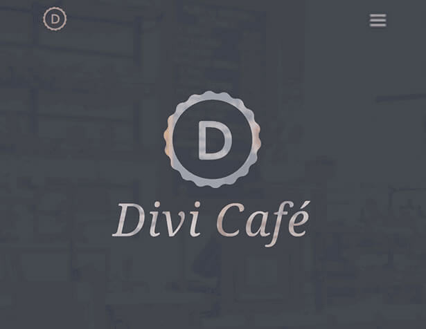
As with the Slide In Header, the Fullscreen Header also hides your primary and secondary navigation links until the hamburger menu icon is clicked.
Once again this allows you to greet your visitors with an uncluttered page containing only the information, which you decide is most important.
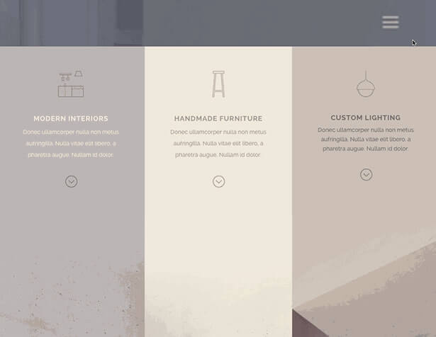
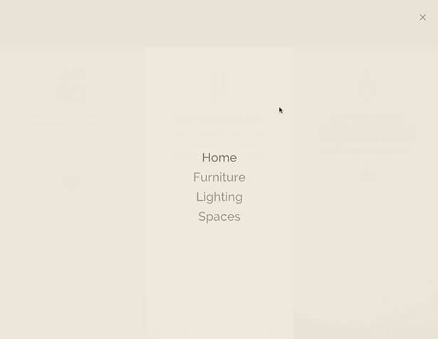
When you click the Hamburger menu your menu is presented in a beautiful full-screen style.
You can customise the colour, opacity and size of the menu and the links, via the Theme Customiser, to allow the page content to be visible behind your menu items and produce some stunning and unique effects.
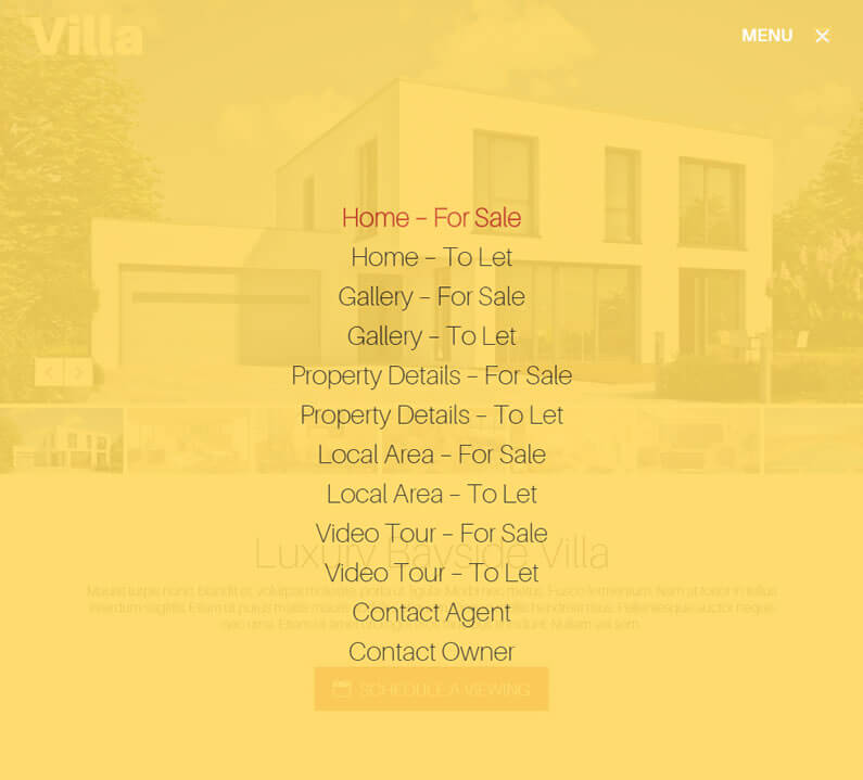
The screenshot below is taken from the Villa real estate child theme by the talented London developer Michelle Nunan.
The opacity of the yellow background colour has been lowered in order to give you a tantalising glimpse of the page content below…. thanks Michelle for giving us a great example of how to use the Fullscreen Header.
Try the new Divi 2.6 Header styles on your website
Divi has always had plenty of Header options, which allowed users to create and customise their Headers, and the two new styles have added a whole new layer of unique, stylish and eye catching Header options.
If you’d like to create some cool Header effects on your site using Divi’s Header styles, then sign up with Elegant Themes, download your copy of Divi and start adding Headers that will both grab and retain the attention of your visitors.
Add the power of the Divi Builder to your site… whatever theme you use!
If you want to add the power of the Divi Builder to your WordPress website, but you want to keep your existing theme, then you need the Divi Builder plugin.
The Divi Builder is a plugin, which works with any WordPress theme and allows you to add all the Divi Builder’s functionality to your website.
This is an example of a page created with the Divi Builder plugin, on a Genesis theme website.
Divi’s New Header Styles: Divi now comes with 2 new header styles that can be selected via the Theme Customizer. The Slide-In and Full-Screen headers are both great additions to Divi’s already versatile header controls.
Nick Roach – Elegant Themes
I hope that you enjoyed the post and that it’s given you an introduction to Divi 2.6’s Header styles and a few ideas for using them on your website.
If you have any thoughts about Divi in general or the new Header styles in particular, then please leave a comment and if you’d like to spread the word about this fabulous Drag and Drop theme, please use my social sharing icons below.
Credits:
My thanks and gratitude to Elegant Themes for the graphics and details of the Divi 2.6 new Header styles used in this post.
