Divi’s responsive design and fluid grid make it looks pretty good on any device, straight out of the box, but there are always those areas that you want to tweak for tablet or mobile viewing.
In the past making those final adjustments meant delving into Media Queries, but Divi 2.6 has relieved you of that dubious pleasure with its new Responsive Editing Controls.
The Divi Builder’s new Responsive Editing controls allow you to assign different sizing and spacing values for each device / breakpoint.
As well as being able to adjust sizes and spacing, you can also disable entire areas on particular devices. All Modules, Rows and Sections now come with a new “Disable On” setting that allows you to disable the element on smartphones, tablets and/or desktop computers.
In this post I’ll run through the new responsive editing controls and then look at a real example of modifying the text size and text area in order to create a good looking tablet and smartphone layout.
My Affiliate Links Disclosure
Hi everyone. Just to let you know that many of the links on this site are my affiliate links. What that means is that if you click one of them and buy something… I get a commission. It doesn’t cost you anything extra and I only recommend things that I’ve tried and tested, so please, please, please… use my links.
Adjust size and spacing for desktop, tablet and smartphone
I’m guessing that most of you design for Desktop viewing and get everything looking perfect using Divi’s Advanced Design Settings. But then you’re faced with the problem of making things look good on tablet and smartphone.
The Divi Builder’s new responsive editing controls solve that problem by giving you control over the sizing, spacing and visibility of Modules on each responsive breakpoint.
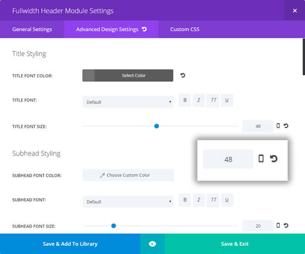
Whenever you modify a Module, Row or Section’s sizing or spacing under the Advanced Design Settings tab, a new smartphone icon appears to the right of the settings value as shown below:
Click the smartphone icon and the Divi Builder’s new responsive editing controls appear above the slider control bar.
The editing controls consist of three tabs: DESKTOP, TABLET and SMARTPHONE.
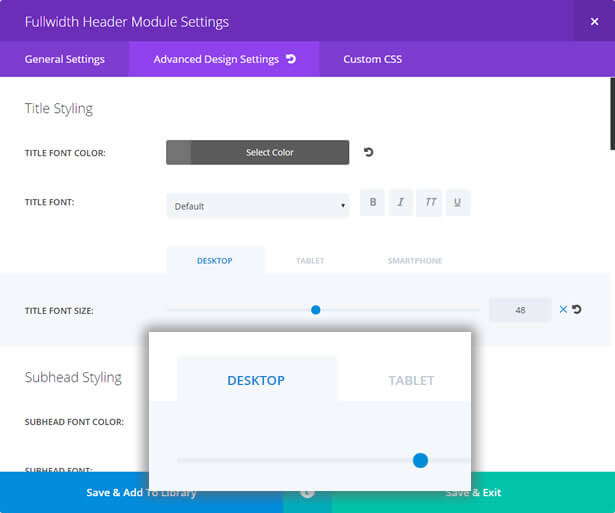
These controls allow you to assign unique values for each device / breakpoint.
In the example below I used a Fullwidth Header module with big, bold title text that looks great on desktop screens.
I then reduced the size of the text for tablet devices and reduced it again for smartphones. I also reduced the width of the text area on both tablets and smartphones.
The screenshot is the tablet view with the text reduced in size in order to be in proportion to the viewing area.
Disable elements for better viewing on mobile devices
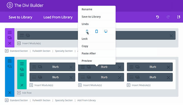
In Divi 2.6 all Modules, Rows and Sections now come with a new “Disable On” setting that allows you to disable the element on smartphones, tablets and/or desktop computers.
This is great when you want to strip down your website’s mobile version so that the small screen is not crowded with too much information.
To disable an element: hover over the element and right click, from the menu which pops up click Disable and then click the appropriate device icons – the icons you click will turn red, to show that they have been selected.
Save the settings and page changes and you’re all done.
Customise your site for all devices with the Divi 2.6 Responsive editing controls
With more and more of us accessing the web on tablets and smartphones, what your website looks like on mobile devices has never been more important.
Divi 2.6’s Responsive editing controls allow you to fine tune and even hide content in order to give all your visitors the optimum viewing experience whatever device they are viewing on and all this… without touching a single media query!
If you’d like to start using the Divi theme to improve the responsiveness of your site, then sign up with Elegant Themes, download your copy of Divi and start designing for tablet and smartphone… as well as desktop.
Add the power of the Divi Builder to your site… whatever theme you use!
If you want to add the power of the Divi Builder to your WordPress website, but you want to keep your existing theme, then you need the Divi Builder plugin.
The Divi Builder is a plugin, which works with any WordPress theme and allows you to add all the Divi Builder’s functionality to your website.
This is an example of a page created with the Divi Builder plugin, on a Genesis theme website.
Responsive Editing Controls – Perhaps the most exciting feature in Divi 2.6 is the Divi Builder’s new Responsive Editing controls, which allow you to assign different sizing and spacing values for each breakpoint.
Nick Roach – Elegant Themes
I hope that you enjoyed the post and that it’s given you a useful introduction to the new Divi 2.6 Responsive editing controls and maybe made you think about the responsiveness of your own website.
If you have any thoughts about Divi in general or the new Editing controls in particular, then please leave a comment and if you’d like to spread the word about this fabulous Drag and Drop theme, please use my social sharing icons below.
Credits:
My thanks and gratitude to Elegant Themes for the graphics and details of the new Divi 2.6 Responsive editing controls used in this post.
